In the digital economy, your website isn’t just a brochure; it’s your primary storefront, your lead generation engine, and the very heart of your brand’s reputation. The experience it delivers is not a trivial matter – it’s directly tied to your bottom line. A slow, frustrating website doesn’t just annoy users; it actively drives them away, costing you customers before they even have a chance to engage with your product. Research has consistently shown that poor performance leads to higher bounce rates, lower conversion rates, and ultimately, lost revenue.
To bring a standardized language to this critical aspect of user experience (UX), Google introduced Core Web Vitals (CWV). These metrics are now a confirmed ranking factor in Google Search, making them essential for not only user satisfaction but also for your site’s visibility. They represent Google’s effort to quantify the real-world experience of interacting with a web page.
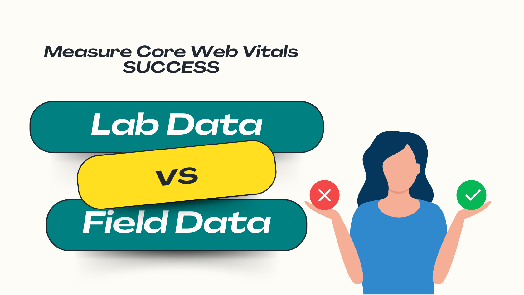
But how do you accurately measure something as subjective as “user experience”? This is where many website owners, marketers, and even developers fall into a common trap: relying on a single tool or a single number. The truth is, a comprehensive performance strategy requires a dual-lens approach. You must understand the crucial difference between testing your site in a controlled, sterile “lab” environment and measuring its performance in the chaotic, unpredictable “field” of real-world use.
This guide will walk you through the essential tools for measuring your Core Web Vitals. We will dissect the fundamental differences between lab and field data, demonstrate why you absolutely need both for a complete picture, and reveal how a holistic strategy – one that looks beyond initial page loads – can unlock a new level of performance and business success.
A Deeper Look at Core Web Vitals: The Pillars of Modern User Experience
Before we dive into the tools, it’s crucial to have a solid understanding of what we’re measuring. Core Web Vitals are a set of three specific metrics that Google has identified as being central to a quality user experience. They focus on three key aspects: loading speed, interactivity, and visual stability. To be considered “Good” by Google, a site must meet the recommended targets for all three metrics, measured at the
75th percentile of user experiences. This means your site needs to provide a good experience to at least three-quarters of your visitors, not just the average user.
For a full breakdown, explore our Core Web Vitas business success guide.
Largest Contentful Paint (LCP): Measuring the “Is It Loading?” Moment
- What it is: Largest Contentful Paint measures the time it takes for the largest image or block of text to become visible within the user’s viewport. In simple terms, it answers the user’s implicit question: “Is this page actually loading something useful?” A fast LCP reassures the user that the page is working and their desired content is on its way.
- Good Score: 2.5 seconds or less.
- Learn More: Unpacking Largest Contentful Paint (LCP): Speeding Up Your Page’s Main Content.
Interaction to Next Paint (INP): Quantifying the “Is It Responsive?” Feeling
- What it is: Interaction to Next Paint is the newest Core Web Vital, replacing First Input Delay (FID) in March 2024. It measures a page’s overall responsiveness by observing the latency of all user interactions (clicks, taps, and keyboard inputs) throughout their visit. It captures the entire duration from a user’s action until the next frame is visually updated on the screen, directly measuring the perception of lag or smoothness.
- Good Score: 200 milliseconds or less.
- Learn More: Ensuring a Responsive Website Experience by Mastering INP
Cumulative Layout Shift (CLS): Gauging the “Is It Stable?” Impression
- What it is: Cumulative Layout Shift measures the visual stability of a page. It quantifies the impact of unexpected layout shifts, where elements on the page move around without user interaction. Have you ever tried to click a button, only for an ad to load above it and push the button down, causing you to click the ad instead? That frustrating experience is what CLS is designed to measure and prevent.
- Good Score: 0.1 or less.
- Learn More: Preventing Annoying Page Jumps by fixing CLS
| Metric | What It Measures | Good | Needs Improvement | Poor |
| Largest Contentful Paint (LCP) | Perceived loading speed; when the main content is likely visible. | ≤2.5s | >2.5s and ≤4s | >4s |
| Interaction to Next Paint (INP) | Overall responsiveness to user interactions throughout the visit. | ≤200ms | >200ms and ≤500ms | >500ms |
| Cumulative Layout Shift (CLS) | Visual stability; how much content unexpectedly shifts on the page. | ≤0.1 | >0.1 and ≤0.25 | >0.25 |
Lab Data Tools – The Diagnostic Workbench
The first category of tools operates in what we call the “lab.” This is where you can put your website on a diagnostic workbench, run tests under controlled conditions, and get detailed, repeatable results.
The Controlled Environment: What is “Lab Data”?
Lab data, also known as synthetic monitoring, is performance data collected in a simulated environment. These tools load your web page using a consistent set of predefined conditions: a specific device (e.g., a mid-tier mobile phone), a set network speed (e.g., a fast 3G connection), and a set location.
Because the environment is controlled, the results are highly consistent and repeatable. This makes lab data incredibly powerful for debugging performance issues, testing changes before they go live, and identifying specific optimization opportunities. Think of it as a scientific experiment; by keeping all variables constant, you can accurately measure the impact of your changes.
Tool Deep Dive: Google PageSpeed Insights (PSI)
Google PageSpeed Insights (PSI) is often the first stop for anyone looking to analyze their site’s performance. It’s a free, web-based tool that provides a comprehensive report on a page’s adherence to performance best practices.
- Primary Function: PSI’s greatest strength is its hybrid nature. It presents both lab data and, field data (if available from last 28 days) for a given URL. This can also be a source of major confusion. The prominent Performance Score (a number from 0 to 100) at the top of the report is generated purely from lab data collected by Lighthouse. The Core Web Vitals Assessment (the “Pass” or “Fail” summary) is based on field data from the Chrome User Experience Report.
- Benefits: PSI shines by providing a prioritized list of actionable recommendations in its “Opportunities” and “Diagnostics” sections. It tells you exactly what to fix, such as “Eliminate render-blocking resources” or “Properly size images,” and even estimates the potential time savings for each fix.
Tool Deep Dive: Lighthouse
Lighthouse is the open-source, automated engine that powers the lab analysis in PageSpeed Insights. While you access it through PSI, you can also run Lighthouse directly in several other ways, most notably within the Chrome Developer Tools (DevTools).
- Primary Function: To run Lighthouse in Chrome, simply open DevTools (right-click on a page and select “Inspect”), navigate to the “Lighthouse” tab, and click “Analyze page load”. This provides a powerful, on-demand auditing tool right in your browser.
- Benefits: Lighthouse goes beyond just performance. It provides separate scores and detailed audits for Accessibility, Best Practices, and SEO. This makes it an invaluable tool for developers to conduct a holistic quality check before deploying code. It allows for deep, local debugging on pages that may not be public or that require authentication to access.
Tool Deep Dive: WebPageTest
While PSI and Lighthouse are excellent for high-level analysis and common issues, WebPageTest is the tool of choice for deep, forensic investigation. It is the most powerful and configurable lab testing tool available.
- Primary Function: WebPageTest allows you to run performance tests from dozens of real, physical locations around the globe, on a vast array of real devices (not just emulations), and across different browsers like Chrome, Firefox, and Safari.
- Benefits: Its standout feature is the detailed request waterfall chart. This chart visualizes every single resource (HTML, CSS, JS, images) that the browser requests to build your page, showing when each request starts and ends. This is indispensable for identifying complex bottlenecks, like render-blocking request chains or slow third-party scripts. Furthermore, WebPageTest supports advanced features like custom scripting, which allows you to test multi-step user flows, such as logging in or adding an item to a shopping cart.
From Diagnosis to Action: Translating Lab Recommendations into Code
The true power of lab tools is that their recommendations can be translated directly into code. Here are two common optimizations they might suggest:
Example 1: Preconnecting to Third-Party Domains
If your site relies on critical resources from other domains (like Google Fonts or an analytics provider), your browser has to perform a DNS lookup, TCP handshake, and SSL negotiation for each new domain. This takes time. A preconnect hint tells the browser to start this connection process early, in the background.
HTML
<link rel="preconnect" href="https://fonts.googleapis.com">
<link rel="preconnect" href="https://fonts.gstatic.com" crossorigin>
Example 2: Preloading Critical Resources
Sometimes, a critical resource needed for the initial render (like your LCP hero image or a specific web font) is discovered late in the loading process. A preload hint tells the browser to fetch this specific resource with high priority, as soon as possible, without waiting.
HTML
<link rel="preload" href="/fonts/brand-font.woff2" as="font" type="font/woff2" crossorigin>
The Limits of the Lab: Why a Perfect Score Isn’t a Perfect Experience
Despite their diagnostic power, lab tools have a fundamental limitation: they are not your users. A perfect 100/100 score in Lighthouse is an excellent achievement, but it doesn’t guarantee a flawless experience for every visitor.
Lab data is a snapshot taken under specific, often idealized, conditions. It cannot account for the vast variability of the real world :
- Network Variability: Your users are on everything from fast fiber optic connections to spotty 4G on a train.
- Device Diversity: They use high-end desktops, budget Android phones, and everything in between.
- Geographic Location: A user in Sydney will have a different experience connecting to your New York-based server than a user in London.
- Browser State: Caching, browser extensions, and other running software can all impact performance.
- User Interaction: Lab tests typically don’t scroll, click, or interact with the page in the unpredictable ways that real humans do.
A lab test is an essential, repeatable hypothesis. To see the real results, you need to go to the field.
Field Data Tools – The Real-World Pulse
If lab data is the diagnostic workbench, then field data is the real-time pulse of your actual users. It’s where you see the true impact of your website’s performance on the people who matter most.
The User’s Perspective: What is “Field Data”?
Field data, also known as Real User Monitoring (RUM), is performance data collected from the actual browsers of people visiting your website. As users navigate your site, their browsers (if they’ve opted in) anonymously report key performance metrics back to a central dataset.
This is the ultimate source of truth for user experience. It’s messy, varied, and reflects the entire spectrum of devices, networks, and behaviors of your audience. Crucially,
this is the data Google uses to determine your site’s Core Web Vitals assessment for search ranking purposes.
Data Source Deep Dive: The Chrome User Experience Report (CrUX)
The Chrome User Experience Report (CrUX) is the public dataset that collects and houses all this field data. It is the official dataset for the Web Vitals program.
- Primary Function: CrUX gathers anonymized performance metrics from a massive cohort of opted-in Chrome users across the web. The data is aggregated over a trailing 28-day period and made publicly available.
- Benefits & Limitations: Because it’s a public dataset covering millions of websites, it’s a powerful tool for competitive analysis. However, it has two key limitations. First, it only includes data from Chrome users, excluding those from other browsers like Safari, Firefox, or even Chrome on iOS devices. Second, a page or website must have sufficient traffic in last 28 days to be included in the report to ensure statistical significance and user anonymity, so low-traffic sites may not have any CrUX data.
Tool Deep Dive: Google Search Console (Core Web Vitals Report)
For website owners, the primary way to interact with their CrUX data is through the Core Web Vitals report in Google Search Console (GSC).
- Primary Function: GSC takes your site’s CrUX data and presents it in an actionable, easy-to-understand format. It shows performance trends over time and, most helpfully, groups URLs with similar performance issues together. For example, it might create a group of “Poor” URLs that all share an “LCP issue: longer than 4s (mobile).”
- Benefits: This grouping allows you to identify systemic issues, such as a template that causes problems across all your blog posts. GSC’s most powerful feature is the “Validate Fix” workflow. After you’ve identified an issue and deployed a fix, you can click this button in GSC. This tells Google to begin a new 28-day monitoring period for that group of URLs. If the collected CrUX data shows that the issue is resolved for 75% of users, the report will update to “Good”.
The Power and Limitations of Field Data
The strengths and weaknesses of field data are the inverse of lab data.
- Strengths: It is the undeniable ground truth. It accurately reflects the aggregate experience of your entire user base, accounting for every real-world variable. It tells you what is actually happening and how urgent a performance problem is.
- Limitations: It is a lagging indicator. Because the data is aggregated over 28 days, it’s not useful for immediate, real-time debugging. It can tell you that your LCP is slow, but it can’t tell you why-was it a slow server, a large image, or a render-blocking script? For that, you need to return to the lab.
Why You Need Both: The Synergy of Lab and Field Data
It should now be clear that lab data and field data are not competitors; they are partners. Relying on one without the other gives you a dangerously incomplete picture of your website’s performance. True performance excellence comes from using them together in a continuous, cyclical workflow.
The Diagnostic-Validation Loop: A Unified Workflow
A mature performance strategy follows a simple but powerful loop that leverages the unique strengths of both data types:
- Monitor with Field Data: Start with your Google Search Console report. It acts as your early warning system, telling you where real users are having a poor experience. For example, GSC flags a group of product detail pages as “Poor” for INP on mobile.
- Reproduce in the Lab: Take one of the example URLs from GSC and test it in a lab tool like WebPageTest or Lighthouse. Critically, configure the test to simulate the conditions of the affected users (e.g., select a mobile device profile and a “Slow 4G” network connection).
- Diagnose with Lab Tools: Use the detailed lab reports to find the root cause. The Lighthouse performance trace or the WebPageTest waterfall might reveal a large, unoptimized third-party script that is blocking the main thread and causing interaction delays.
- Fix and Test in the Lab: Implement a fix-perhaps by deferring the script or replacing it with a lighter alternative. Run the lab test again under the same conditions to confirm that your fix has resolved the issue and improved the lab metrics.
- Deploy and Validate with Field Data: Deploy your fix to your live site. Then, go back to Google Search Console and click “Validate Fix.” Over the next 28 days, CrUX will collect new data from your real users. If the fix was successful, you’ll see that group of URLs turn from “Poor” to “Good” in your report, confirming a real-world improvement.
This cycle of Monitor -> Reproduce -> Diagnose -> Fix -> Validate is the cornerstone of sustainable performance improvement.
Bridging the Data Gap
The table below summarizes the key characteristics of each data type, highlighting why they are both indispensable parts of your toolkit.
| Characteristic | Lab Data (Synthetic Monitoring) | Field Data (Real User Monitoring – RUM) |
| Data Source | Simulated page loads on a server. | Anonymized data from actual user browsers (via CrUX). |
| Environment | Controlled and consistent (fixed device, network, location). | Uncontrolled and variable (real-world devices, networks, locations). |
| Primary Use Case | Diagnosing problems and testing fixes in a repeatable way. | Monitoring real-world experience and validating the impact of fixes. |
| Strengths | – Highly detailed reports (waterfalls, traces). – Repeatable and consistent for A/B testing changes. – Excellent for pre-production debugging. | – The “ground truth” of user experience. – Captures the full diversity of the user base. – The data used by Google for rankings. |
| Limitations | – Does not reflect real-world user variability. – A “good score” doesn’t guarantee a good UX for everyone. – Cannot measure post-load user interactions well. | – Lagging indicator (28-day aggregation). – Not detailed enough for root-cause analysis. – Data may be unavailable for low-traffic pages. |
| Key Tools | Google PageSpeed Insights (Lab Score), Lighthouse, WebPageTest. | Google Search Console (CWV Report), CrUX dataset, PageSpeed Insights (CWV Assessment). |
Beyond Metrics: How Smart Prefetch Elevates Real User Experience
So far, we’ve focused on the tools and techniques for optimizing the performance of a single page load. This is where most performance conversations begin and end. But what about the rest of the user’s journey? A user’s experience doesn’t reset every time they click a link. The speed and fluidity of navigations between pages are just as critical for engagement, conversions, and overall satisfaction. This is the next frontier of performance optimization.
The Evolution of an Idea: From Simple Hints to Intelligent Prediction
For years, developers have had a basic tool to address this: the prefetch resource hint. By adding a simple tag to a page, you can give the browser a “hint” to download a specific page or resource in the background during its idle time.
HTML
<link rel="prefetch" href="/next-page.html">
The problem with this approach is that it’s a static, manual guess. The developer has to decide what to prefetch, and if that guess is wrong, the user’s bandwidth is wasted downloading resources they’ll never use.
The Smart Prefetch Advantage: AI-Powered Predictive Prefetching
This is where Smart Prefetch changes the game. Instead of relying on manual guesswork, our plugin uses AI and machine learning to create a dynamic, predictive model of user behavior on your site. It analyzes navigation patterns from your real traffic to understand which page a user is most likely to visit next from their current page.
Based on these high-confidence predictions, Smart Prefetch intelligently and automatically prefetches the necessary resources for that next page before the user even clicks the link. The result? When the user does click, the next page load feels nearly instantaneous, creating a seamless and fluid browsing experience that keeps them engaged and moving through your conversion funnel.
Measuring the “Invisible” Improvement: The Crucial Distinction
Here is the most important concept to understand: if you install Smart Prefetch and run a Google PageSpeed Insights test on your homepage, you likely won’t see a change in your lab Performance Score. Why? Because lab tools are designed to measure a single, isolated page load. They have no concept of a user’s journey or a subsequent navigation.
The profound benefits of Smart Prefetch are not visible in a single lab test; they are visible in your field data and your business metrics over time.
- Impact on Field Data (CrUX & GSC): When Smart Prefetch makes the navigation to
page-Bfrompage-Ainstantaneous, the LCP for that visit topage-Bis dramatically improved. The INP for the click interaction that led topage-Balso becomes exceptionally fast. As thousands of users benefit from this, these improved metrics are collected by CrUX. Over 28 days, you will see the aggregate Core Web Vitals scores for your internal pages improve in your Google Search Console report. You are genuinely making the experience better for real users, and the field data will prove it. - Impact on Business KPIs: The ultimate goal of performance is business success. A faster, more fluid user journey directly translates into metrics that matter :
- Lower Bounce Rates: Users are less likely to leave when navigation is effortless.
- Higher Pages-Per-Session: Users are encouraged to explore more of your site.
- Increased Conversion Rates: A frictionless path to purchase means more completed checkouts and form submissions.
The Technical Edge: Automation at Scale
Smart Prefetch automates this entire sophisticated process. It intelligently manages prefetching at scale, using modern browser APIs like the Speculation Rules API to do so efficiently, while also respecting user preferences like “Save-Data” mode to avoid consuming data on restricted plans. It takes the powerful concept of prefetching and makes it smart, dynamic, and effortless to implement.
Conclusion: Building a Culture of Continuous Performance Excellence
Measuring and improving your website’s performance is not a one-time task; it’s a continuous commitment to your users. A truly effective strategy recognizes the performance paradox: that a perfect score in a sterile lab means little if it doesn’t translate to a fantastic experience in the messy, unpredictable real world. By embracing a holistic workflow that uses lab tools for diagnosis and field tools for validation, you can build a site that is not only technically sound but also genuinely delightful for your visitors.
But fixing initial load times is only the beginning. True excellence lies in optimizing the entire user journey, making every interaction, every navigation, feel instant and intuitive. This is the competitive edge that turns casual visitors into loyal customers.
Ready to move beyond initial load times and turbocharge your website’s entire user journey? Start your free trial today and see the impact on your business, not just your reports.