Let’s start with a quick gut check. Have you ever landed on a website that looked fantastic-clean design, beautiful images, crisp typography-only to leave moments later in a fit of frustration? It’s a common experience. Often, the culprit is a confusing menu. But sometimes, the problem is more subtle. You find the link you need, you click it, and then… you wait. And wait. The perfect user journey grinds to a halt, broken by a slow-loading page.
This is the central challenge of modern web design. Creating a truly intuitive experience isn’t just about showing users where to go; it’s about getting them there instantly. This article unpacks that challenge, from the foundational principles of good navigation design to the cutting-edge technology that finally closes the gap between a great layout and a genuinely fast experience.
Here are the key takeaways you’ll walk away with:
- Intuitive navigation is more than just a map; it’s a frictionless journey. A successful user experience depends not only on clear labels and logical structure but also on eliminating the frustrating wait times between pages.
- Even a perfect menu fails if the destination is slow. The most thoughtfully designed navigation system is undermined the moment a user clicks a link and stares at a loading spinner. This “temporal friction” shatters the user’s flow, damages trust, and costs you conversions.
- Predictive prefetching technology is the solution to temporal friction. By intelligently loading the next page a user is most likely to visit before they click, this technology makes navigation feel instantaneous, creating a seamless and delightful browsing experience.
- The true impact of instant navigation is measured in the real world. While this technology delivers a profoundly better user experience, its benefits are seen in real-world user behavior (field data) and business KPIs like conversion rates, not in synthetic lab tests like Google PageSpeed Insights.
Why Getting Lost is a Business Problem
In the digital world, a user’s attention is the most valuable currency, and it’s incredibly fragile. When a visitor lands on your site, you have a vanishingly small window to prove your value. If they can’t find what they’re looking for quickly and effortlessly, they won’t hesitate to leave. And the data shows they probably won’t be back.
88% of online consumers are less likely to return to a site after a bad user experience.
This single statistic should be a wake-up call for any business with a web presence. A poor experience isn’t a minor inconvenience; it’s a direct threat to customer loyalty and retention.
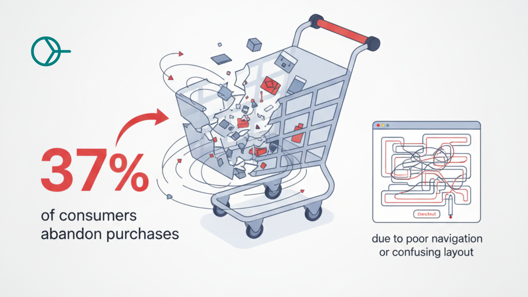
So, what constitutes a “bad experience”? While slow-loading pages are a major factor (which we’ll dive into later), one of the most frequently cited sources of frustration is poor navigation. A survey by Storyblok revealed that 37% of consumers have abandoned purchases specifically due to a website’s poor navigation or confusing layout.
Think of a user’s journey as a delicate chain of micro-decisions. Each click is an investment of trust and attention. A well-designed navigation system makes these decisions feel effortless, guiding the user smoothly toward their goal. A confusing or frustrating system, however, breaks this chain. It increases cognitive load-the mental effort required to use a site-and introduces friction at every step. This friction quickly turns into distrust and, ultimately, abandonment. A lost user isn’t just a lost pageview; it’s a lost sale, a missed lead, and a crack in your brand’s credibility.
The Psychology of a Seamless Journey: Core Design Principles
The ultimate goal of navigation design is to become invisible. It should align so perfectly with a user’s expectations and mental models that they don’t have to think about how to use your site; they can simply focus on what they came to do. Achieving this level of intuition requires a deep understanding of human psychology and a commitment to user-centric design principles.
Simplicity and Predictability: The Power of Reducing Cognitive Load
Have you ever felt overwhelmed by a restaurant menu with hundreds of items? That feeling of decision paralysis is a real psychological phenomenon, and it applies directly to website navigation. Hick’s Law, a foundational principle in UX design, states that the time it takes to make a decision increases with the number and complexity of choices available.
When a user is confronted with a navigation bar packed with a dozen or more options, their brain has to work harder to process the information and decide where to go. This cognitive overload, also related to psychologist Barry Schwartz’s “Paradox of Choice,” often leads to frustration and a quick exit.
Application:
- Limit Your Main Menu: The consensus among UX experts is to limit your primary navigation menu to no more than seven or eight items, with a sweet spot of around five to seven. This constraint forces you to prioritize what’s truly important and organize your site’s content into a clear, logical hierarchy.
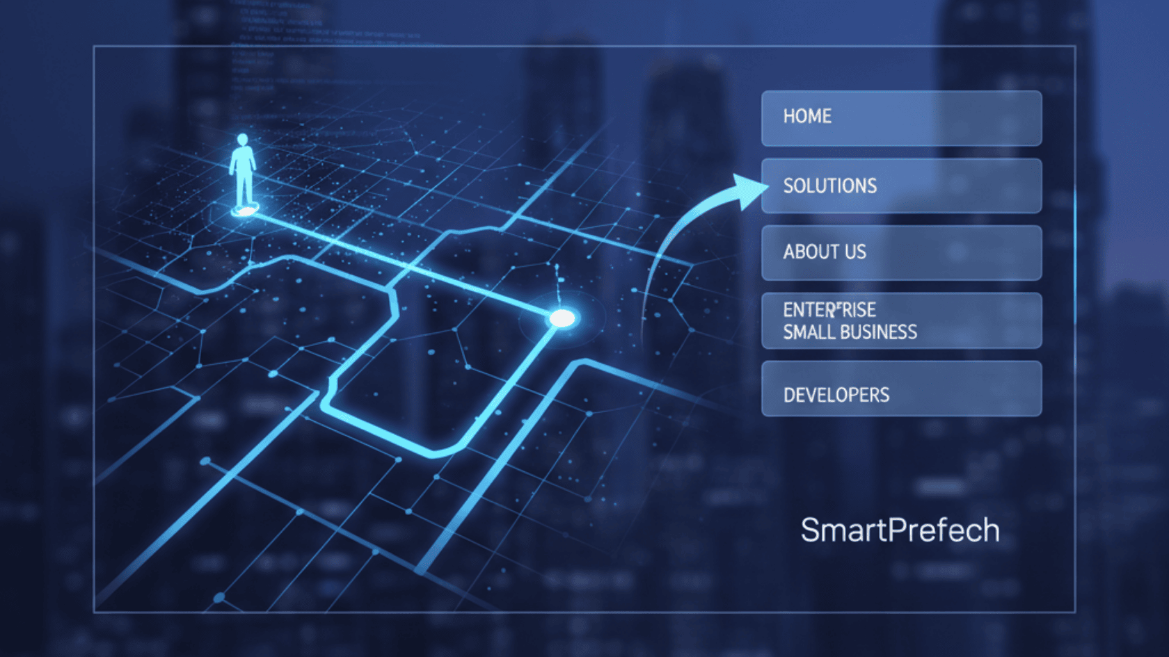
- Use Familiar Layouts: Users have developed strong expectations from their time on the web. They expect to find the main navigation at the top of the page and the company logo in the top-left corner, which usually links back to the homepage. Deviating from these established conventions without a very good reason forces users to learn a new system, increasing their cognitive load.
Clarity Above All: Using Descriptive and User-Centric Labels
Your navigation labels are the signposts that guide users through your site. This is not the place for clever marketing jargon or creative ambiguity. Vague terms like “Solutions,” “Resources,” “Products,” or “What We Do” are common but ineffective. They force users to stop and guess what lies behind the link, introducing a moment of friction and uncertainty.
A user should know exactly what they will get when they click a link. The label should confidently answer their internal question: “What will I find here?”
Application:
- Be Specific: Instead of “Products,” use a more descriptive label like “Men’s Running Shoes.” Instead of “Services,” try “Residential Landscaping.”
- Use User-Centric Language: Frame your labels from the user’s perspective. “Get a Quote” is more direct and action-oriented than “Pricing Information.”
This commitment to clarity offers a powerful secondary benefit. Optimizing your navigation labels for user understanding is, by its very nature, also optimizing for modern, intent-based SEO. When a label uses a specific, relevant keyphrase (like “Custom Web Design Services”), it does two things simultaneously. First, it signals the page’s relevance to search engines, helping them understand your site’s structure and content. Second, that same specific label perfectly matches the user’s mental model and potential search query, creating a strong “information scent” that tells them they’re on the right path. The goals of great UX and great SEO are perfectly aligned here.
Consistency is King: Building User Trust and Muscle Memory
Imagine driving a car where the brake pedal is in a different place every time you get in. It would be a stressful and dangerous experience. The same principle applies to website navigation.
Consistency in the placement, appearance, and behavior of your navigation elements is crucial for creating a predictable and trustworthy experience. When the navigation bar is always in the same spot, with the same colors and fonts, and dropdown menus always behave the same way, users can build a mental map of your site. This “muscle memory” allows them to navigate without conscious thought, freeing up their mental energy to focus on your content and offerings.
Key Areas for Consistency:
- Placement: The main navigation should appear in the same location on every page.
- Visual Design: Use consistent colors, typography, and spacing for all navigation elements.
- Interaction Patterns: Hover effects, active states, and dropdown behaviors should be uniform across the site.
- Terminology: A link labeled “Contact Us” on one page shouldn’t be called “Get in Touch” on another.
Always Provide a Compass: Indicating the User’s Location
A common source of user anxiety is feeling “lost in hyperspace”-not knowing where they are within a website’s structure or how to get back to where they came from. Effective navigation systems provide constant orientation cues, acting as a digital compass for the user.
Primary Methods for Orientation:
- Breadcrumbs: These are secondary navigation aids that show the user’s hierarchical path through the site (e.g., Home > Services > Web Design). They are incredibly effective for helping users understand their location and easily navigate back up to higher-level pages.
- Highlighted Active States: The current page the user is on should be visually distinguished in the main navigation menu. This can be achieved through a different background color, a contrasting text color, bolding, or an underline.
- Clear Page Headers: The main heading (<h1>) of a page should directly correspond to the navigation link that the user clicked to get there. This simple reinforcement provides immediate confirmation that they’ve landed in the right place.
- Descriptive URLs: A clean, readable URL like
yourdomain.com/products/womens-bootsoffers an additional, subtle layer of context for savvy users and is also beneficial for SEO.
Designing for the Real World: Mobile-First Navigation Patterns
With well over half of all global web traffic now coming from mobile devices, designing for a small screen is no longer an afterthought-it’s the primary consideration. Furthermore, user expectations are sky-high;
85% of users believe a company’s mobile website should be as good as or even better than its desktop counterpart.
Mobile navigation presents unique challenges, including limited screen real estate and the need for touch-friendly interactions. This has led to the development of several established patterns:
- The “Hamburger” Menu: The three-line icon is now a universally recognized symbol for a hidden menu, saving valuable screen space.
- Bottom Navigation Bars: Often used in mobile apps, this pattern is great for providing persistent access to the most important sections of a site (e.g., Home, Search, Account).
- Accordion Menus: For pages with nested categories, collapsible accordion menus allow users to drill down into content without being overwhelmed by a long list.
- Prominent Search: For many mobile users with a specific goal, a highly visible search bar is the fastest way to bypass navigation menus entirely.
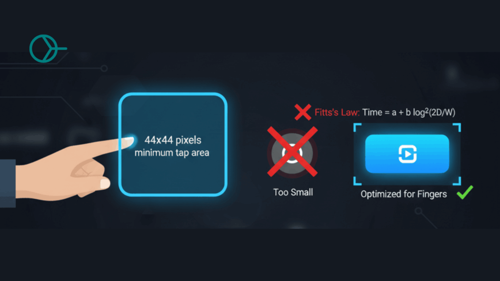
A critical technical detail for mobile design is the size of your tap targets. To accommodate fingers instead of precise mouse cursors-and to align with Fitts’s Law, which relates target size to ease of use-interactive elements like buttons and links should have a minimum tap area of 44×44 pixels.
Code Corner: Building a Semantic and Accessible Navigation Menu
Putting these principles into practice starts with clean, semantic HTML. Using the correct HTML elements not only helps search engines understand your site’s structure but is also crucial for accessibility, ensuring that users with screen readers can navigate your site effectively.
For any major block of navigation links-like your main site menu or an on-page table of contents-you should use the <nav> element. It’s important to note that this isn’t meant for
all groups of links; for example, the list of links commonly found in a website’s footer is better suited to being placed within the <footer> element without a wrapping <nav>.
Inside the <nav> element, the best practice is to structure your links as an unordered list (<ul>), because a menu is, semantically, a list of navigation items.
Here is a simple, effective, and accessible HTML structure for a primary navigation menu:
<nav aria-label="Main Navigation">
  <ul>
    <li><a href="/" aria-current="page">Home</a></li>
    <li><a href="/about/">About Us</a></li>
    <li><a href="/services/">Services</a></li>
    <li><a href="/blog/">Blog</a></li>
    <li><a href="/contact/">Contact</a></li>
  </ul>
</nav>
A quick note on the aria attributes:
aria-label="Main Navigation"provides a descriptive name for the navigation block, which is helpful for screen reader users if you have multiple<nav>elements on a page (e.g., one for site navigation and one for on-page links).aria-current="page"programmatically tells assistive technologies which link corresponds to the page the user is currently on, providing that crucial sense of location.
And here’s some basic CSS to turn that list into a functional horizontal navigation bar:
/* Basic nav container styling */
nav[aria-label="Main Navigation"] {
  background-color: #f8f8f8;
  border-bottom: 1px solid #e7e7e7;
  padding: 10px 20px;
}

/* Remove default list styling */
nav ul {
  list-style-type: none;
  margin: 0;
  padding: 0;
  display: flex; /* Arrange items horizontally */
  gap: 20px; /* Space between items */
}

/* Style the links */
nav ul li a {
  text-decoration: none;
  color: #333;
  font-weight: bold;
  padding: 5px 10px;
  border-radius: 4px;
  transition: background-color 0.3s ease;
}

/* Add a hover effect */
nav ul li a:hover {
  background-color: #ddd;
}

/* Style the active/current page link */
nav ul li a[aria-current="page"] {
  background-color: #007bff;
  color: #fff;
}
This simple foundation provides a clean, accessible, and user-friendly starting point for any website’s navigation. But as we’re about to see, this is only half the battle.
The Unseen Obstacle: When Perfect Navigation Meets Temporal Friction
You’ve done everything right. Your navigation is simple, clear, consistent, and perfectly structured. A user arrives, immediately understands where to go, and clicks a link with confidence. The journey should be seamless. But then, it happens: a blank white screen, a spinning wheel, a progress bar inching across the top of the browser.
This is the final, frustrating hurdle where so many user experiences fall apart. A user’s journey doesn’t end when they successfully click a link; it ends when the content of the next page is fully loaded and usable. The delay between these two points is what we can call temporal friction.
Temporal friction is the cognitive and emotional strain caused by waiting. Even a delay of just a couple of seconds is enough to break a user’s concentration, disrupt their flow, and replace the positive feeling of a well-designed interface with doubt and annoyance.
This is more than just a minor inconvenience; it’s a fundamental business problem that actively destroys the return on investment from your UX design efforts. Companies invest significant time, money, and talent into researching user behavior, mapping journeys, and crafting intuitive interfaces. The entire goal of this investment is to reduce cognitive load, build trust, and guide users smoothly towards a conversion. Temporal friction does the exact opposite: it increases cognitive load (“Is this site broken?”), it erodes trust (“This company’s site is slow and unprofessional”), and it brings the user’s journey to a dead stop. All the money spent on beautiful menus and logical information architecture is effectively wasted the moment a user is left waiting. Performance isn’t a separate technical issue; it’s the component that allows your design investment to pay off.
The Data Doesn’t Lie: Quantifying the Impact of Every Millisecond
The cost of temporal friction is not theoretical. It can be measured directly in user behavior and lost revenue. While a well-designed UI can boost conversion rates by as much as 200%, a slow website can erase those gains in an instant.
Consider these powerful statistics:
- According to Google, as a page’s load time increases from just 1 second to 3 seconds, the probability of a user bouncing increases by 32%.
- The problem is even more acute on mobile, where 53% of users will abandon a site that takes longer than 3 seconds to load.
- Even a one-second delay can have a measurable impact, with some studies showing it can lead to a 7% reduction in conversions.
Now, apply this to your navigation. Each click in your menu-from the homepage to a category page, then to a product page, and finally to the cart-is a potential exit point. A three-step journey presents three opportunities for a user to become frustrated by temporal friction and abandon the process. Your perfectly designed navigation has become a minefield of potential bounce points.
The Ultimate Upgrade: Eliminating Waiting with Predictive Prefetching
For years, the solution to temporal friction has been to optimize the destination page: compress images, minify code, leverage caching. These are all essential practices. But what if we could change the game entirely? What if, instead of just making the next page load faster, we could make it load before the user even asks for it?
This is the promise of prefetching.
A Glimpse into Instant Navigation: Understanding Prefetching
At its core, prefetching is a technique that provides a hint to the browser, telling it to download a resource in the background that a user might need in the near future. This is typically done by adding a
<link> tag to the <head> of your HTML document.
For example, if you are confident a user on your product page will likely click through to the checkout page, you could add this hint:
HTML
<link rel="prefetch" href="/checkout.html" as="document">When the browser sees this tag, it will wait until the current page is loaded and the network is idle, and then it will download checkout.html with a very low priority. This is key-it doesn’t steal bandwidth from the critical resources needed for the current page. If the user then clicks the “Checkout” button, the HTML file is already in their browser’s cache, and the page appears to load almost instantly. For a deeper technical dive, you can explore the official MDN doc.
The Leap from Basic to Intelligent: The Rise of Predictive Prefetching
Basic prefetching is powerful, but it comes with a significant drawback. If you’re not sure where the user will go next, what do you prefetch? Some simple strategies involve prefetching every link that’s currently visible on the screen. The problem? Most of those links will never be clicked.
This naive approach leads to a massive amount of wasted bandwidth and data for the user, and it creates unnecessary load on your server. It’s like a waiter bringing you every single dessert on the menu just in case you might want one. It’s inefficient and wasteful.
The solution is to move from guessing to knowing. Predictive prefetching uses data, analytics, and machine learning to determine the single most likely next page a user will visit from their current location, and it prefetches only that one URL. This intelligent approach delivers all the performance benefits of an instant page load without any of the waste.
Introducing Smart Prefetch: Your AI Co-pilot for an Instant Website
This is where the power of intelligent automation comes in. Smart Prefetch is an AI-powered SaaS plugin designed to completely automate the process of predictive prefetching, making your website’s navigation feel instantaneous without any complex configuration.
Here’s how it works in a few simple steps:
- Data Collection: A lightweight, privacy-first script is added to your site. It anonymously collects non-personal navigation data-essentially, tracking which pages users typically navigate to from any given page.
- AI Analysis: This data is fed into advanced machine learning algorithms. The AI engine analyzes these user journeys to build a powerful predictive model of your site’s traffic patterns, identifying the most common pathways with high accuracy.
- Smart Prefetching: Once a user lands on a page, Smart Prefetch consults its predictive model. It then dynamically injects a prefetch hint for the single most probable next page. It does this using the cutting-edge Speculation Rules API in modern browsers, ensuring the most efficient and standards-compliant implementation possible.
- Instant Navigation: When the user clicks on that predicted link, the page loads almost instantly from the browser’s cache. The temporal friction is gone. The user’s journey is seamless.
The benefits are directly tied to the problems we’ve discussed. By eliminating the waiting time between pages, Smart Prefetch boosts perceived speed, dramatically improves the user experience, reduces bounce rates, and ultimately leads to higher engagement and conversions. The setup is designed to be incredibly simple, often taking just a few minutes to install and activate, as outlined in guides for platforms like WordPress/WooCommerce and Shopify. For businesses looking to maximize their online revenue, the potential return on investment is substantial, making it a strategic choice with clear pricing tiers.
The Measurement Paradox: Why Your Lab Scores Don’t Tell the Whole Story
At this point, you might be thinking, “This sounds great! I’ll install it and watch my Google PageSpeed Insights score go to 100.” This is a logical assumption, but it’s where we encounter a crucial and often misunderstood nuance in web performance measurement: the difference between lab data and field data.
Understanding Your Toolbox: Lab Data vs. Field Data
There are two fundamentally different ways to measure how fast your website is, and they tell you very different things.
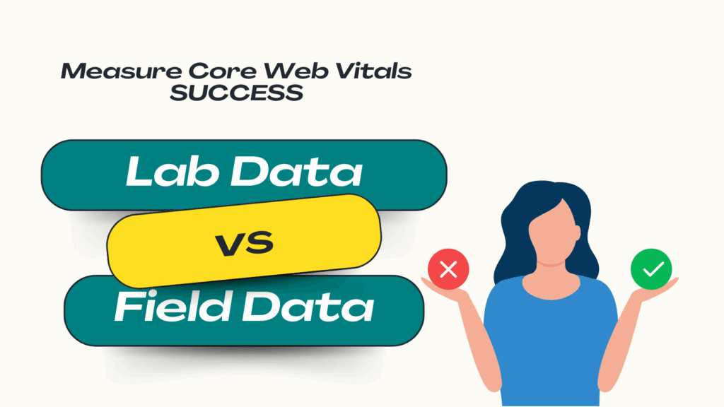
- Lab Data (Synthetic Testing): This is data collected in a perfectly controlled, simulated environment. A tool like Google Lighthouse loads your page on a server using a fixed device profile (e.g., a mid-tier mobile phone) and a throttled network connection. It’s repeatable, consistent, and incredibly valuable for debugging technical issues before you deploy them. Tools that provide lab data include PageSpeed Insights (the “Performance” score section), Lighthouse, WebPageTest.
- Field Data (Real User Monitoring – RUM): This is data collected from your actual visitors as they browse your site in the real world. It captures the true user experience across a massive variety of devices, network conditions, locations, and browser types. This is the data that reflects what your customers are really experiencing. Sources for field data include the Chrome User Experience Report (CrUX), the Core Web Vitals report in Google Search Console, and dedicated RUM platforms.
The distinction is critical, and a simple table can help clarify the key differences:
| Feature | Lab Data (Synthetic Testing) | Field Data (Real User Monitoring) |
| Environment | Controlled & Simulated | Real-World & Variable |
| User Context | Fixed Device & Network | Diverse Devices, Networks & Locations |
| Primary Purpose | Debugging, Reproducibility, Pre-launch Checks | Measuring True User Experience, Business Impact |
| Key Tools | Lighthouse, PageSpeed Insights, WebPageTest | CrUX, Google Search Console, RUM Platforms |
| View of Prefetching | Measures the initial page load only. Cannot see the benefit on subsequent navigations. | Captures the entire user journey, revealing faster loads on subsequent, prefetched pages. |
Why Prefetching Doesn’t “Improve” Your Lighthouse Score (And That’s Okay)
This brings us to the core of the paradox. Lab testing tools like Lighthouse are designed to measure the performance of a single, isolated page load from a cold start. They have no concept of a “user journey,” a “previous page,” or a “next page.”
Prefetching is an optimization for the transition between pages. The prefetch action itself happens on the first page, consuming a tiny amount of bandwidth in the background after the page is already interactive. A lab test, which is hyper-focused on that initial load, might even register this tiny background activity as a slight negative.
The massive performance benefit of prefetching-the instant load-occurs on the second page the user visits. But the lab test never measures that second page load.
Think of it this way: It’s like judging a chef on how long it takes them to chop vegetables, without ever tasting the final meal that’s served incredibly quickly because of that prep work. Lighthouse sees the prep (the prefetch) but completely misses the payoff (the instant next page).
Where the Real-World Wins Appear: Tracking Gains in RUM and CrUX
So, if you can’t see the benefit in your Lighthouse score, where do you look? You look at the data that reflects real human behavior. The positive impact of predictive prefetching is overwhelmingly evident in field data and business-level analytics.
- In Your Analytics Platform (e.g., Google Analytics):
- Lower Bounce & Exit Rates: Look at key user funnels. You should see a lower percentage of users dropping off between a category page and a product page, or between a product page and the cart.
- Higher Pages Per Session: When navigation is frictionless and instant, users are encouraged to explore more of your site.
- Increased Conversion Rates: By removing a major point of friction from multi-step processes (like checkout or lead forms), you will see a direct lift in goal completions.
- In Your Field Data (CrUX and Google Search Console):
- Over time (CrUX operates on a 28-day rolling average), the positive user experiences created by instant navigation contribute to better Core Web Vitals scores in the field. Subsequent page loads that are served instantly from the prefetch cache will record extremely fast Largest Contentful Paint (LCP) times, improving your site’s overall field data profile.
Understanding this distinction between lab and field data is fundamental to crafting an exceptional user experience (UX) that prioritizes real-world results over synthetic scores.
Conclusion: From Flawless Design to an Instant Experience
We began this journey by exploring the art of building an intuitive map for our users-a navigation system so clear and logical that it feels invisible. We mastered the principles of simplicity, clarity, and consistency, laying the foundation for a seamless user journey.
But we quickly discovered that a perfect map is useless if the roads are full of potholes. The temporal friction caused by slow-loading pages acts as a hidden bottleneck, undermining our best design efforts, frustrating users, and costing us business.
The solution lies in evolving our thinking-from simply making pages faster to making them instant. Intelligent, predictive prefetching technology is the bridge that connects great UX design with the instant performance that modern users demand. It’s the final, crucial piece of the puzzle that ensures your investment in a beautiful, user-friendly design actually pays off by delivering an experience that is not just well-structured, but genuinely effortless.
Stop letting slow page loads undermine your design. Bridge the gap and deliver a truly instant user journey. Smart Prefetch and let your users experience the web as it should be.
Frequently Asked Questions (FAQ)
If prefetching tools like Smart Prefetch don’t improve my PageSpeed Insights score, how can I measure their ROI and justify the investment?
This is an excellent and crucial question that gets to the heart of modern web performance strategy. The key is to shift the focus from a single, synthetic lab score to the real-world business metrics that are directly impacted by user experience. While a PageSpeed Insights score is a useful diagnostic tool, it doesn’t measure user journeys or business outcomes. The ROI of an instant navigation experience is measured by tracking changes in actual user behavior.
Here is a simple, step-by-step approach to measuring the ROI:
- Establish a Baseline: Before implementing a predictive prefetching solution, use your analytics platform (like Google Analytics) to record key metrics over a stable period (e.g., 30 days). This is your “before” snapshot.
- Track Key User Engagement Metrics: After implementation, monitor the following metrics for positive changes against your baseline:
- Conversion Rate: This is the most direct measure of ROI. Are more users completing key goals like making a purchase, signing up for a newsletter, or filling out a contact form? An increase here translates directly to revenue.
- Bounce Rate & Exit Rate at Funnel Steps: Don’t just look at the overall bounce rate. Analyze the drop-off rate between critical pages in your user journey. For an e-commerce site, this would be the exit rate on product pages or the abandonment rate in the checkout flow. A reduction in these figures means the seamless navigation is keeping users on the path to conversion.
- Average Session Duration & Pages Per Session: Are users exploring more of your site? When moving between pages is instant, curiosity is rewarded, and users are more likely to engage more deeply with your content.
- Monitor Field Data for Long-Term Trends: In Google Search Console, keep an eye on your Core Web Vitals report. While this data is aggregated over 28 days, sustained positive user engagement signals-like lower bounce rates and faster subsequent page loads-can contribute to improved field data scores for metrics like LCP and INP over time.
- Calculate the Financial ROI: Connect the dots. Case studies have shown that instant navigation can lead to significant conversion lifts, with some users of Smart Prefetch seeing an average increase of 4.1%. For an e-commerce store generating $50,000 in monthly revenue, a 4.1% lift translates to an additional $2,050 per month, or $24,600 per year. This tangible financial gain provides a clear and powerful justification for the investment, one that is far more meaningful to your bottom line than a few extra points on a synthetic lab test.