Key Takeaways
- Mobile Isn’t Just a Channel, It’s The Channel: With mobile commerce projected to surpass $2.5 trillion in 2025 and driving over 78% of e-commerce traffic, treating it as a secondary thought to desktop is a direct path to revenue loss.
- Mobile-First is a Strategy, Not Just a Technique: While responsive design reacts to screen size, a mobile-first approach proactively forces you to prioritize essential content and functionality, leading to a leaner, faster, and more user-centric experience on all devices.
- Your PageSpeed Score is a Lab Test, Not Reality: Lab data from tools like Lighthouse is a useful diagnostic, but it doesn’t capture the real-world experience of your users. Field data (RUM) is what truly reflects how performance impacts your conversions.
- The Journey Matters More Than the Landing: Initial page load speed is crucial, but the perceived speed between pages is where conversions are won or lost. Technologies like AI-powered prefetching create an “instant-feeling” navigation that keeps users engaged and moving toward checkout.
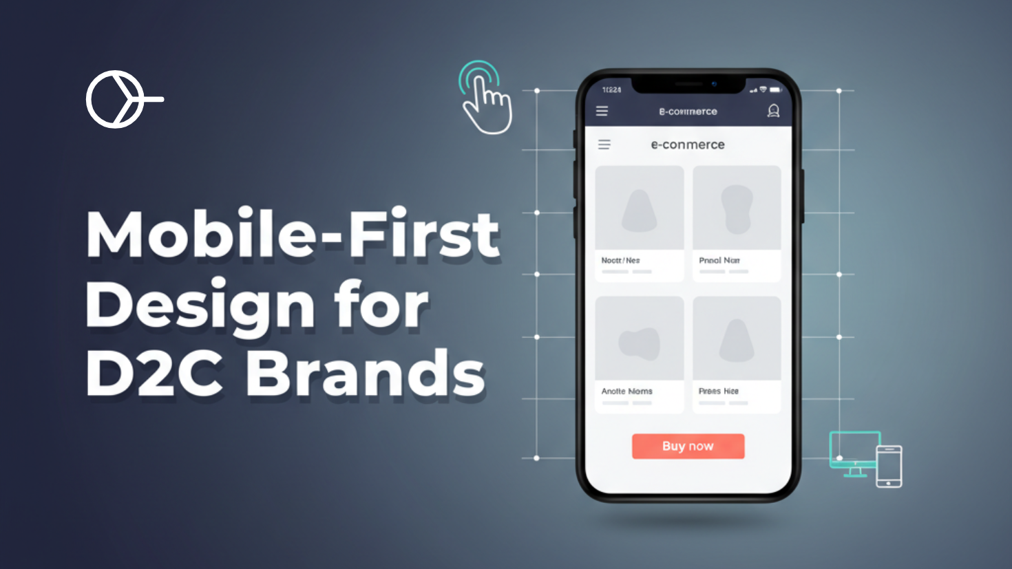
Introduction: The Mobile Paradox-Why Your Beautiful D2C Store is Leaking Revenue
As a founder or marketing head of a direct-to-consumer (D2C) brand, you live and breathe the customer experience. You’ve invested heavily in a stunning brand identity, captivating high-resolution photography, and a compelling story that resonates with your audience. Your desktop site is a masterpiece, a digital flagship that perfectly encapsulates your brand’s essence. Yet, when you look at your analytics, a frustrating paradox emerges: high mobile traffic paired with alarmingly high bounce rates and a trail of abandoned carts.
What’s going wrong? The common assumption is that if a website is “responsive”-if it simply shrinks to fit a mobile screen-the job is done. This is a dangerous oversimplification and one of the most significant revenue leaks for D2C brands today. A responsive website is reactive; it adapts. But adaptation is not the same as optimization. It’s the technical equivalent of a one-size-fits-all garment that stretches to fit but is never truly tailored to the wearer.
The solution isn’t a minor tweak or a new plugin; it’s a fundamental shift in mindset. To win in today’s market, D2C brands must move from a reactive “responsive design” model to a proactive, strategic “mobile-first” philosophy. This isn’t just about how your website looks; it’s about building a business that meets your customers where they are-on their phones. This philosophy forces you to prioritize what truly matters for conversion and builds a foundation for a faster, more intuitive experience on every device. Furthermore, as we’ll explore, true performance excellence goes beyond the initial page load, focusing on the entire user journey to create a seamless, “instant-feeling” experience that turns browsers into buyers.
Your Phone is Your Flagship: The Undeniable Reality of Mobile Commerce in 2025
The debate is over. Mobile is not a rising trend or an important channel; it is the primary arena where e-commerce battles are won and lost. For D2C brands, particularly in the visually-driven fashion and beauty sectors, the smartphone is not just a device-it’s the main storefront, the fitting room, and the checkout counter, all rolled into one. Ignoring this reality is akin to locking the doors to your flagship store during peak hours.
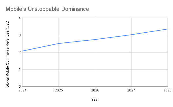
The Data Tsunami: Mobile’s Unstoppable Dominance
The numbers paint a clear and urgent picture. We are deep into the mobile era, and the scale of this shift is staggering. Consider the global trajectory of mobile commerce:
| Year | Global Mobile Commerce Revenues | Annual Growth | Share of Total Retail E-commerce |
| 2024 | $2.07 trillion | +21.1% | 57% |
| 2025 | $2.51 trillion | +21.3% | 59% |
| 2026 | $2.74 trillion | +9.2% | 60% |
| 2027 | $3.02 trillion | +10.2% | 62% |
| 2028 | $3.35 trillion | +10.9% | 63% |
In 2024 alone, mobile commerce revenues are set to surpass the $2 trillion mark for the first time. By 2025, mobile is projected to account for nearly 60% of all online retail sales globally.
The engine behind this growth is clear: mobile devices now drive an overwhelming 78% of all e-commerce traffic and generate 66% of all orders.
Source: Oberlo
The stakes are incredibly high. A poor mobile experience isn’t just a minor inconvenience; it’s a direct gift to your competition. Statistics show that 40% of users will abandon a site for a competitor after a single bad mobile experience. For a D2C brand fighting for market share, that’s a catastrophic, self-inflicted wound.
Spotlight on D2C Fashion & Beauty: The Mobile-Native Customer
For D2C fashion and beauty brands, these macro trends are amplified. Your customer’s journey no longer begins on a desktop computer by typing your URL into a browser. It begins with a tap.
The “front door” to your brand has moved from your homepage to a social media feed. Platforms like TikTok, Instagram, and YouTube are the new discovery engines, with shoppable content and influencer campaigns driving the initial spark of interest. When a potential customer sees a new product in a TikTok video and clicks the link in the bio, their first interaction with your brand will be on a mobile device. That first impression is made in seconds, and if the page is slow, clunky, or difficult to navigate, the sale is lost before it ever had a chance.
Furthermore, the very technologies that are reshaping the fashion and beauty industries-such as Augmented Reality (AR) “try-on” features and interactive livestream shopping-are inherently mobile-centric. Nearly 60% of the US population is expected to be frequent AR users by 2025, and products with AR features see a staggering 94% higher conversion rate. Similarly, live commerce, led by the fashion and apparel sector, can achieve conversion rates up to 10 times higher than traditional e-commerce. These are not desktop experiences; they are rich, interactive mobile engagements.
This shift in user behavior from a predictable, desktop-centric path to a fragmented, mobile-first entry point has profound implications. It’s no longer sufficient to optimize your homepage. Every product page, every campaign landing page, every blog post linked from social media is a potential “front door.” Each one must be engineered to deliver a flawless mobile experience, because you only get one chance to convert that click.
Responsive vs. Mobile-First: The Difference Between Adapting and Leading
In conversations about web design, the terms “responsive” and “mobile-first” are often used interchangeably. This is a critical error. While they are related, they represent two fundamentally different approaches to building a website. One is a technical tactic; the other is a core business strategy. Understanding this distinction is the first step toward unlocking your brand’s true mobile potential.
Defining the Terms with Clarity
Responsive Web Design (RWD) is a technical approach that allows a website’s layout to adapt to the screen size it’s being viewed on. It uses flexible grids, fluid images, and CSS media queries to reflow content, ensuring that a single website can be used on a desktop, tablet, or smartphone. Think of it as water: it takes the shape of its container. RWD is a foundational, non-negotiable component of modern web development. A website that isn’t responsive is effectively broken for a majority of users. However, RWD is reactive-it responds to the screen size, but it doesn’t inherently prioritize the mobile experience.
Mobile-First Design, on the other hand, is a design philosophy. It dictates that the design process should begin with the smallest screen-the mobile phone-and then scale up for larger devices. This is a principle known as progressive enhancement. You start with the core, essential functionality and content needed for a great mobile experience. Then, as more screen real estate becomes available on tablets and desktops, you progressively add more features, richer interactions, and supplementary content. It’s about building a strong, lean foundation and then thoughtfully expanding upon it.
The Old Way: Graceful Degradation
To fully appreciate the mobile-first approach, it helps to understand its predecessor: the “desktop-first” model, also known as graceful degradation. For years, websites were designed for large desktop monitors first. The mobile version was an afterthought, created by stripping away features, hiding elements, and shrinking components to fit a smaller screen. This often resulted in a compromised and clunky mobile experience. Important features might be hidden behind extra clicks, and heavy, desktop-sized assets would be downloaded (but hidden), slowing the site to a crawl on mobile networks. This approach treats the mobile experience as a lesser, degraded version of the “real” desktop site.
The Strategic Business Benefits of Mobile-First
Adopting a mobile-first philosophy is not merely a choice for your design team; it’s a strategic decision that has a cascading positive impact on your entire business.
- Forced Prioritization (Content-First): The greatest strength of the mobile-first approach is its constraints. The limited real estate of a mobile screen forces you to be ruthless about what is truly important. It compels your marketing, product, and design teams to answer critical business questions before development even begins: What is the single most important action we want a user to take on this page? What is the absolute essential information they need to make a decision? This “content-first” approach eliminates fluff and results in a cleaner, more focused, and higher-converting user journey on all devices, not just mobile.
- Inherent Performance Gains: When you start with a lean mobile base, you build performance in from the ground up. Mobile-first sites are naturally faster because you are only loading the assets necessary for the mobile experience. As you scale up to larger screens, you add assets, rather than trying to hide or shrink heavy desktop assets on mobile. This leads to faster load times, especially on slower mobile networks, which directly impacts user satisfaction and conversion rates.
- Improved SEO: Google’s search algorithm uses mobile-first indexing, meaning it predominantly uses the mobile version of your content for indexing and ranking. A site that is built from the ground up to provide a superior mobile experience is directly rewarded with better visibility in search results, driving more organic traffic.
Ultimately, the shift to mobile-first is less a design trend and more a fundamental business discipline. It forces a level of strategic clarity that benefits the entire organization. By asking “what is essential for our mobile customer?” you are forced to refine your value proposition, streamline your user journey, and focus on the actions that directly drive revenue. It’s a forcing function for strategic alignment that pays dividends far beyond just your website’s design.
The Mobile-First Blueprint: Actionable Strategies for D2C Brands
Moving from theory to practice is where the true value of a mobile-first philosophy is realized. For D2C brands, this means translating the principles of prioritization and progressive enhancement into tangible design and development choices that directly impact the bottom line. Here is a blueprint for implementing a mobile-first strategy.
Content-First, Conversion-Focused Design
A mobile-first design is inherently a user-focused design. On a small screen, every pixel counts, and the user’s attention is a precious resource.
- Clear Visual Hierarchy: The most important elements must be the most prominent. For a D2C product page, this means the product image, name, price, and the “Add to Cart” button should be immediately visible without scrolling. Less critical information, like detailed specifications or shipping policies, can be placed further down or within expandable accordions.
- Intuitive Navigation: Mobile navigation must be simple and predictable. Complex, multi-level dropdown menus that work on desktop are a nightmare on mobile. Prioritize your main product categories and use clear, concise labels. A common and effective pattern is the “hamburger” menu, which keeps navigation options neatly tucked away until needed, freeing up screen space for content. For more on this, explore our guide on designing intuitive navigation.
- Touch-Friendly UI: Mobile users navigate with their thumbs, not a precise mouse cursor. All interactive elements-buttons, links, form fields-must be large enough to be tapped easily without accidental clicks. Apple recommends a minimum tap target size of 44×44 pixels. Ensure there is ample spacing between tappable elements to prevent user frustration, a common issue that leads to abandonment.
The High-Resolution Image Challenge
Fashion and beauty brands live and die by their visuals. High-quality, detailed product photography is non-negotiable. However, these stunning images are often massive files that can cripple mobile performance. A mobile-first approach addresses this challenge head-on.
- Choose the Right Format: Modern image formats like WebP and AVIF offer significantly better compression than traditional JPEGs, meaning they can reduce file sizes by 50% or more with little to no perceptible loss in quality. Serving these next-gen formats is one of the single most effective ways to speed up your site.
- Compress and Resize: Never upload a high-resolution image directly from your photographer and rely on the browser to shrink it. This forces the user to download a massive file only to see a small version of it. Use image compression tools to reduce file size and resize images to the actual dimensions they will be displayed at on different devices (e.g., a smaller version for mobile, a larger one for desktop).
- Implement Lazy Loading: Lazy loading is a technique that defers the loading of offscreen images until the user scrolls down to them. This dramatically improves the initial page load time, as the browser only has to load the images visible in the viewport.
For a deep dive into these techniques, see our comprehensive guide on optimising images for speed.
DIY Corner: Implementing the Fundamentals
Understanding the technical implementation of these concepts can empower you to have more effective conversations with your development team or even make changes yourself.
Mobile-First CSS with Media Queries
This code demonstrates the core principle of progressive enhancement. We start with base styles for mobile (a single-column layout) and then use min-width media queries to add complexity for larger screens. This ensures that mobile devices download the simplest, leanest CSS possible. Media query fundamentals is an excellent resource in this area.
/* Base styles for mobile devices (single column) */
.product-grid {
  display: block;
}

.product-card {
  margin-bottom: 20px;
}

/* Styles for tablets and up (768px and wider) */
@media (min-width: 768px) {
 .product-grid {
    display: grid;
    grid-template-columns: repeat(2, 1fr); /* Two columns */
    gap: 20px;
  }
}

/* Styles for desktops and up (1024px and wider) */
@media (min-width: 1024px) {
 .product-grid {
    grid-template-columns: repeat(4, 1fr); /* Four columns */
  }
}
Responsive Images with srcset and sizes
This HTML <img> tag is a powerful tool for tackling the high-resolution image problem. It allows the browser to choose the most appropriate image file to download based on the user’s screen size and resolution, saving bandwidth and speeding up load times. This is a strategic decision to prioritize the experience of users on slower mobile networks, which directly impacts conversions. To learn more, consult Using responsive images MDN guide.
<img
  srcset="dress-small.jpg 480w,
          dress-medium.jpg 800w,
          dress-large.jpg 1200w"
  sizes="(max-width: 600px) 480px,
         (max-width: 900px) 800px,
         1200px"
  src="dress-large.jpg"
  alt="Elegant red evening dress">
For a D2C leader, understanding these technical fundamentals provides the vocabulary to guide their development team effectively. You can move from a vague request like “make the site faster” to a specific, strategic directive like, “Are we using a mobile-first CSS approach with min-width queries and implementing srcset for our product images to optimize our LCP for mobile users?” This level of informed direction leads to better execution and superior business results.
The Performance Blind Spot: Why Your PageSpeed Score Isn’t the Whole Story
In the quest for a faster website, PageSpeed Insights tool has become ubiquitous. Brands and agencies often become fixated on achieving a green “90+” score, believing it to be the ultimate seal of approval for performance. While this tool is valuable, an over-reliance on its score can create a dangerous blind spot, leading to a false sense of security while real users are still having a poor experience. To understand why, it’s essential to grasp the difference between two types of performance data: lab and field.
Introducing the Two Types of Data: Lab vs. Field
- Lab Data (Synthetic Monitoring): This is the data you get from tools like PageSpeed Insights and Lighthouse. It’s a performance test run in a controlled, simulated environment with a predefined device and network speed. The key benefits of lab data are that it’s consistent, reproducible, and provides detailed diagnostics, making it excellent for debugging specific technical issues. To use an analogy, lab data is like testing a car’s 0-60 mph time on a perfect, empty race track under ideal weather conditions. It tells you the car’s maximum potential performance without thinking about actual performance in real-world challenges.
- Field Data (Real User Monitoring – RUM): This is aggregated performance data collected from all of your actual users as they browse your site in the real world. This data reflects the vast diversity of your audience’s conditions: different devices (from the latest iPhone to older Androids), varying network speeds (from fast home Wi-Fi to spotty 4G), geographic locations, and browser configurations. This is the data that populates the CrUX, and it’s what Google’s ranking algorithms primarily consider when evaluating your site’s experience. Continuing the analogy, field data is like measuring the car’s average commute time for thousands of real drivers in real city traffic, complete with rain, potholes, and other cars. It tells you the car’s actual performance in the real world.
Why the Discrepancy?
It’s common to see a great lab score alongside poor field data. This happens because the controlled lab environment rarely matches the reality of your users. A lab test might be run on a fast network with a powerful CPU, while a significant portion of your users might be on mid-range smartphones with slower connections. Other factors like browser caching (which speeds up repeat visits for real users but isn’t a factor in a “first-time” lab test) and the performance impact of third-party scripts on logged-in users can also create a significant gap between the two data sets.
Connecting to Core Web Vitals (CWV)
Google’s Core Web Vitals–Largest Contentful Paint (LCP) for loading, Interaction to Next Paint (INP) for interactivity, and Cumulative Layout Shift (CLS) for visual stability-are the key metrics for measuring user experience. These metrics are measured in both lab and field contexts. While a lab test can give you a snapshot of your CWV under ideal conditions, it’s your site’s performance on these metrics for the 75th percentile of your real users (your field data) that truly reflects the quality of their experience and directly influences your SEO rankings.
The obsessive pursuit of a perfect lab score can be counterproductive. Teams can spend weeks implementing complex optimizations that move the needle in a synthetic test but have little to no impact on the real-world experience of the majority of their users. The strategic shift required is to move from “chasing the score” to “improving the reality.” This means using lab data for what it’s good for-diagnosing issues-but making the 75th percentile of your field data the ultimate source of truth for your performance strategy. This is a more accurate and impactful way to measure and improve the performance that actually drives revenue.
From Fast to Instant: Winning the User Journey with Smart Prefetching
Optimizing the initial page load is a critical first step, but it’s only half the battle. A user’s experience is not defined by a single page view; it’s a journey that unfolds across multiple pages. For a D2C customer, that journey might look like this: Homepage → Category Page → Product Page → Cart → Checkout. Even if each of these pages loads in a “fast” 2-3 seconds, the cumulative friction of waiting between each step creates a disjointed, frustrating experience. This “in-between” time is where hesitation builds, momentum is lost, and conversions die.
The new frontier of performance optimization is not just making pages load fast, but making the entire user journey feel instantaneous.
What is Prefetching?
Prefetching is a modern web performance technique that allows a browser to fetch resources for a page a user is likely to visit before they actually click the link. It’s a low-priority hint that tells the browser, “During your idle time, you might want to start downloading the HTML for this page in the background.” When the user does click the link, the page content is already in the browser’s cache, and it appears to load instantly.
Introducing Smart Prefetch: AI-Powered Predictive Loading
While basic prefetching can be effective, it often relies on developers manually guessing which links a user will click next. This is inefficient and can lead to wasted bandwidth if the guess is wrong.
This is where Smart Prefetch changes the game. Our solution elevates this concept by using AI to create a far more intelligent and effective system:
- Analyze: A lightweight script on your site anonymously analyzes real user navigation patterns, identifying the most common paths and journeys your customers take.
- Predict: Our AI models process this data to predict, with up to 90% accuracy, the most likely next page a user will visit from any given page on your site.
- Prefetch: Smart Prefetch then dynamically instructs the browser to prefetch the HTML for that predicted next page during idle time, using the cutting-edge Speculation Rules API where available for maximum efficiency.
- Instant: When the user clicks the predicted link, the page loads almost instantly, creating a seamless, fluid, and app-like browsing experience that keeps them engaged and moving down the conversion funnel.
Connecting Prefetching to the Lab vs. Field Data Dilemma
This is where the concepts from the previous section become critically important. If you install an AI-powered prefetching solution and run a PageSpeed Insights test on your product page, you will see no improvement in your score. This is by design. Lab tests measure a single, isolated page load from a cold start. They are incapable of measuring the performance of a subsequent navigation within a user journey.
The transformative impact of prefetching is seen exclusively in your field data and your business metrics. By making navigations feel instantaneous for real users, you will see a direct and measurable improvement in:
- Lower Bounce Rates: Users are more likely to continue exploring your site when there’s no friction between pages.
- Longer Session Durations: An instant experience encourages deeper engagement and more product discovery.
- Higher Conversion Rates: A seamless journey from product discovery to checkout is one of the most powerful ways to reduce cart abandonment. Data shows that a mere 0.1-second improvement in site speed can boost retail conversions by 8.4%. Smart Prefetch delivers a perceived improvement that is many times greater than that.
This positions Smart Prefetch as a tool that optimizes for what truly matters: the reality of your users’ experience and the direct impact on your revenue. It’s about moving beyond optimizing for a synthetic test score and starting to optimize for real-world business outcomes. This represents a paradigm shift in performance strategy-from making individual pages fast to making the entire user journey feel instant. For a D2C brand, this is a powerful competitive advantage, keeping shoppers in a state of flow and significantly reducing the psychological friction that leads to lost sales.
Conclusion: Build for Mobile, Optimize for Journeys, and Convert More Customers
The path to e-commerce success in 2025 is paved with mobile screens. For D2C brands, the evidence is overwhelming: your mobile presence is your business. Simply having a responsive site that shrinks to fit is no longer enough. The winning strategy is a proactive, mobile-first philosophy that forces clarity, prioritizes the user, and builds performance into the very foundation of your digital experience.
This journey begins with embracing the constraints of the small screen to create a lean, conversion-focused design. It continues with a sophisticated understanding of performance, recognizing that the synthetic scores of lab tests are merely a diagnostic tool, while the real-world experiences of your customers-captured in field data-are the true measure of success.
But the ultimate competitive advantage lies in looking beyond the initial page load. The most significant friction in the customer journey often occurs in the moments between pages. By eliminating that friction, you can transform a clunky, disjointed session into a fluid, engaging experience that guides users effortlessly from discovery to purchase.
Smart Prefetch is the key to unlocking this final frontier of performance optimization. Our AI-powered predictive prefetching makes subsequent page loads feel instantaneous, directly impacting the field data and business metrics that matter most: user engagement, session length, and, ultimately, your conversion rate. It’s the crucial technology that bridges the gap between a site that is technically fast and one that feels instant to your customers, delivering a measurable lift to your bottom line.
Don’t let a sub-par mobile experience leak another dollar of revenue. It’s time to build for mobile, optimize for the entire journey, and convert more of the customers you’ve worked so hard to attract.
Frequently Asked Questions (FAQ)
1. My website is already built with a desktop-first, responsive approach. Is it too late to go mobile-first?
It’s never too late to adopt a mobile-first mindset. A complete redesign is not always necessary or feasible. You can begin applying mobile-first principles iteratively. Start by using analytics to identify the biggest friction points in your mobile user journey-perhaps a complex navigation menu, slow-loading product pages, or a cumbersome checkout form. Prioritize fixing these high-impact areas first. Focus on optimizing images for mobile, simplifying forms, and ensuring key calls-to-action are large and thumb-friendly. Over time, these incremental changes, guided by a mobile-first philosophy, can transform your user experience without the need for a massive overhaul.
2. Will prefetching slow down the user’s current page or use up their mobile data?
This is a common and important concern. Modern prefetching techniques, like those used by Smart Prefetch, are implemented as low-priority hints to the browser. This means the browser will only download the prefetched resources during idle time, after the current page has finished loading and is fully interactive. This process is designed to have zero negative impact on the performance of the page the user is currently viewing. Furthermore, Smart Prefetch is intelligent about resource usage; it avoids prefetching on slow network connections or when a user has a “data-saver” mode enabled in their browser, ensuring a responsible and user-friendly approach.
3. How does Smart Prefetch improve my Core Web Vitals if it doesn’t change my Lighthouse score?
This question gets to the heart of the lab vs. field data distinction. A single-page lab test like Lighthouse cannot measure the benefit of prefetching because its value is realized on subsequent page loads. However, prefetching can have a significant positive impact on your field Core Web Vitals, which are aggregated from all your real user sessions. For example, when a user navigates to a prefetched page, the LCP (Largest Contentful Paint) for that page will be dramatically faster for that real user. Over thousands of user sessions, this improvement is reflected in your site’s overall field data. More broadly, by creating a faster and more fluid journey, prefetching improves the overall Page Experience, which is what Google’s ranking systems are ultimately designed to measure and reward.