In the digital economy, speed isn’t just a feature; it’s the foundation of the user experience. A slow website doesn’t just test a user’s patience-it actively damages your bottom line. Recent data paints a stark picture: a mere one-second delay in page load time can trigger a 7% drop in conversions. For B2B sites, a page that loads in one second boasts a conversion rate three times higher than a site that takes five seconds to load. On mobile devices, the penalty is even steeper, with every second of delay potentially slashing conversions by up to 20%.
This isn’t just about lost sales; it’s about the subtle erosion of brand trust. In an era of shrinking attention spans, users expect instant gratification. A slow-loading site breeds frustration and creates a negative perception that often lingers, making users less likely to return or recommend your brand. The data is unequivocal: as page load time increases from one to three seconds, the probability of a user bouncing skyrockets by 32%.
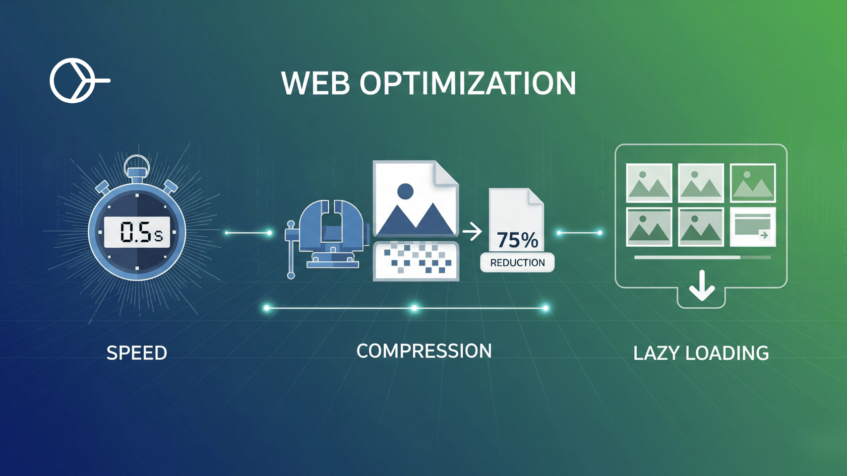
Among the many factors that contribute to page bloat and slow load times, one culprit stands out: images. As the heaviest assets on most web pages, unoptimised images are frequently the primary bottleneck standing between you and a fast, responsive user experience. Mastering the art and science of image optimization is therefore not just a technical task for developers; it is a critical business strategy for anyone serious about succeeding online. This guide provides a comprehensive playbook for optimizing your images, from modern formats and intelligent compression to responsive delivery and strategic loading-the essential first steps toward a faster website and a superior user experience.
How Unoptimised Images Sabotage Core Web Vitals
Google’s Core Web Vitals (CWV) are a set of standardized, user-centric metrics designed to measure the real-world experience of a webpage, focusing on three key areas: loading performance, interactivity, and visual stability. These metrics-Largest Contentful Paint (LCP), Interaction to Next Paint (INP), and Cumulative Layout Shift (CLS)-are not just abstract numbers; they are official ranking factors derived from anonymized data from actual Chrome users, known as the Chrome User Experience Report (CrUX). Unoptimised images are a primary cause of poor scores across two of these critical vitals.
A website that loads quickly and remains stable isn’t just technically proficient; it’s demonstrating respect for the user’s time and attention. This builds a foundation of reliability and professionalism. Conversely, a slow, shifting page creates friction and frustration, signaling to the user that the site may not be trustworthy. In this way, poor CWV scores are not merely technical failures but breaches of user trust, directly impacting both search engine performance and brand perception.
Largest Contentful Paint (LCP): The Waiting Game
Largest Contentful Paint measures the time it takes for the largest content element-most often a hero image or a large block of text-to become visible within the user’s viewport. To provide a good user experience, Google recommends an LCP of 2.5 seconds or less.
Large, unoptimized images are the single most common cause of poor LCP scores. When a browser encounters a massive image file, it must spend precious time downloading it over the network. This “resource load time” is a major component of the LCP calculation. However, simply compressing an image isn’t a silver bullet. LCP is a multi-stage process; if the browser discovers the LCP image late in the loading process (for example, if it’s loaded via JavaScript), the time saved on a smaller file size will simply be shifted to a longer “render delay”. The key to optimizing LCP is ensuring the main image is both lightweight and discoverable by the browser as early as possible.
Cumulative Layout Shift (CLS): The Unstable Experience
Cumulative Layout Shift measures the visual stability of a page by quantifying how much its content unexpectedly moves or “shifts” during the loading phase. A good CLS score is less than 0.1. A high CLS score is a hallmark of a poor user experience, where a user might attempt to click a button only for an ad or image to load and push the target out of the way.
The most frequent cause of CLS is images that lack explicit width and height attributes in their HTML <img> tag. Without these dimensions, the browser has no way of knowing how much vertical space to allocate for the image before it has been downloaded. The browser initially renders the text and other elements, and when the image file finally arrives, it has to forcibly make room for it, pushing all the surrounding content down the page. This jarring shift creates a frustrating and untrustworthy experience, directly contributing to a poor CLS score.
The Ultimate Image Optimization Playbook
Optimizing images is a multi-faceted process that involves choosing the right format, applying the correct compression, and ensuring the browser loads the asset in the most efficient way possible. Following this five-step playbook will address the most significant performance issues and dramatically improve your Core Web Vitals.
Step 1: Embrace Next-Gen Formats (WebP & AVIF)
For decades, JPEG and PNG have been the workhorses of the web. JPEG, with its lossy compression, is excellent for photographs, while PNG’s lossless compression is ideal for graphics requiring transparency or sharp detail. However, both have been surpassed by modern formats that offer significantly better compression efficiency.
WebP and AVIF are next-generation image formats designed to provide higher quality at much smaller file sizes.
- WebP: Developed by Google, WebP images are typically 25-34% smaller than equivalent JPEGs. It supports both lossy and lossless compression, as well as transparency and animation.
- AVIF: Based on the AV1 video codec, AVIF offers even more impressive compression, with file sizes often up to 50% smaller than JPEGs of comparable quality.
While browser support for these formats is now widespread, it’s still crucial to provide a fallback for older browsers. The HTML <picture> element is the perfect tool for this, allowing you to specify multiple sources in order of preference. The browser will use the first supported format it encounters.
Implementation Example:
HTML
<picture>
  <source srcset="image.avif" type="image/avif">
  <source srcset="image.webp" type="image/webp">
  <img src="image.jpg" alt="A descriptive alt text for accessibility and SEO" width="800" height="600">
</picture>
| Format | Best For | Compression | Transparency | Animation | Avg. Savings vs. JPEG |
| JPEG | Photographs, complex images | Lossy | No | No | N/A |
| PNG | Logos, graphics with sharp lines, transparency | Lossless | Yes | No | (Larger file size) |
| WebP | Versatile replacement for JPEG & PNG | Both | Yes | Yes | 25-35% |
| AVIF | Highest quality, maximum compression | Both | Yes | Yes | ~50% |
Step 2: Master Compression (Lossy vs. Lossless)
Image compression algorithms reduce file size, and they fall into two main categories: lossy and lossless. Understanding the difference is key to making the right trade-off between file size and image quality.
- Lossless Compression: This method reduces file size by identifying and eliminating redundant data without discarding any information from the original file. When the image is uncompressed, it is a perfect reconstruction of the original. This is ideal for images where absolute fidelity is paramount, such as technical diagrams or logos. PNG is a classic lossless format. The downside is that the file size reduction is modest.
- Lossy Compression: This method achieves much smaller file sizes by permanently removing data that the algorithm deems imperceptible to the human eye. While this results in some quality degradation, modern algorithms are so effective that at moderate compression levels, the quality loss is often visually undetectable. This “visually lossless” approach is the best choice for the vast majority of images on the web, especially photographs. JPEG, and the lossy modes of WebP and AVIF, use this technique.
Tools of the Trade: Numerous online tools can help you compress your images effectively before uploading them to your site.
- Squoosh: A powerful, browser-based tool from Google that lets you experiment with various formats and compression settings in real-time.
- Tinypng: A popular and simple tool for compressing PNG and JPEG files with excellent results.
- Imagify: Offers smart compression that automatically finds the best balance between quality and file size, and can also convert images to WebP and AVIF.
- RabbitLoader: All-in-one website performance optimization service.
| Feature | Lossy Compression | Lossless Compression |
| File Size Reduction | Significant (up to 90%) | Modest (typically 5-20%) |
| Image Quality | Some data is permanently lost, but can be visually imperceptible | Perfect reconstruction of the original, no quality loss |
| Reversibility | No, data removal is permanent | Yes, the original file can be perfectly restored |
| Best Use Cases | Photographs, complex images for web use | Logos, technical diagrams, text-heavy images, archives |
Step 3: Define Image Dimensions to Eliminate Layout Shift
As discussed, failing to specify an image’s dimensions is a primary cause of CLS. The fix is remarkably simple: always include width and height attributes on your <img> tags.
HTML
<img src="your-image.jpg" alt="An image causing layout shift">
<img src="your-image.jpg" alt="A stable, well-behaved image" width="800" height="600">
By providing these attributes, you give the browser the information it needs to calculate the image’s aspect ratio (in this case, 4:3) and reserve the appropriate amount of space in the layout while the image file downloads. This prevents the content below it from shifting and ensures a stable, user-friendly loading experience.
It is a common misconception that these attributes prevent an image from being responsive. You can-and should-still use CSS to control the final rendered size. The HTML attributes are purely a hint for the browser to reserve space.
CSS
img {
  max-width: 100%;
  height: auto; /* This maintains the aspect ratio */
}
Step 4: Deliver Responsive Images with srcset and sizes
Serving a massive, 1200px-wide image to a user on a small mobile screen is inefficient and wasteful. The srcset and sizes attributes solve this by allowing you to provide a “menu” of different-sized images, from which the browser can select the most appropriate one for the user’s device.
This technique, known as resolution switching, is the cornerstone of modern responsive image delivery.
Implementation Example:
HTML
<img srcset="image-small.jpg 480w,
             image-medium.jpg 800w,
             image-large.jpg 1200w"
     sizes="(max-width: 600px) 480px,
            800px"
     src="image-medium.jpg"
     alt="A responsive image that adapts to the viewport"
     width="800" height="600">
Let’s break this down:
srcset: This attribute lists the available image files and their intrinsic widths (indicated by thewdescriptor). Think of it as the list of options.sizes: This attribute is a crucial hint for the browser. It specifies the size the image will be displayed at under different viewport conditions. Here, it says: “if the viewport is 600px or less, the image will be 480px wide. Otherwise, it will be 800px wide.”src: This is the fallback for very old browsers that don’t supportsrcset.
With this information, the browser can make an intelligent choice. If a user is on a device with a 500px wide screen, the browser knows the image will be displayed at 480px and will download image-small.jpg, saving significant bandwidth compared to downloading the 1200px version.
Step 5: Implement Lazy Loading Strategically
Native browser lazy loading is a powerful feature that defers the download of off-screen images until a user scrolls near them. It’s incredibly easy to implement with the loading="lazy" attribute and is an excellent way to improve initial page load times.
However, there is a critical mistake to avoid: never lazy-load images that are visible above the fold. This is a common performance anti-pattern that directly harms your LCP score.
When you add loading="lazy" to an image, you are explicitly telling the browser that this image is not a high-priority resource. If that image happens to be your LCP element (like a hero banner), you are instructing the browser to delay the download of your most important visual content. This creates a longer “load delay” for the LCP resource, worsening your score and making the page feel slower to the user.
Best Practice:
- Above the Fold: Let images load eagerly (the default behavior). You can even give your LCP image an extra hint with
fetchpriority="high". - Below the Fold: Apply
loading="lazy"to all images that are not in the initial viewport.
HTML
<img src="hero-image.jpg" alt="Main hero banner" fetchpriority="high" width="1200" height="800">
<img src="secondary-image.jpg" alt="An image further down the page" loading="lazy" width="800" height="600">
Beyond the First Load: Optimizing the Entire User Journey with Smart Prefetch
The optimization techniques covered so far are essential for making your initial page load incredibly fast. They will significantly improve your scores in lab-based testing tools and provide a great first impression. But the user experience doesn’t end after one page. A truly optimized website delivers a seamless, instant experience throughout the entire user journey, from the first click to the last. This is where we need to look beyond lab scores and focus on what real users experience in the wild.
The Limits of a Perfect Lab Score: Lab vs. Field Data
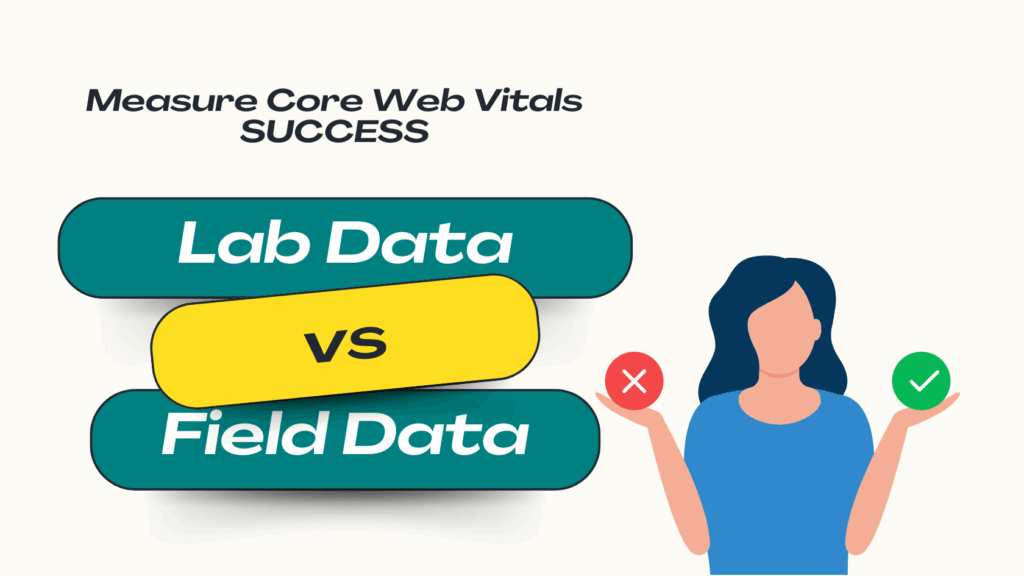
When measuring web performance, it’s crucial to understand the difference between two types of data:
- Lab Data: This is data collected in a controlled, simulated environment, like a test run with Google Lighthouse. It measures a single page load on a specific device and network configuration. Lab data is invaluable for debugging and catching performance regressions before they go live.
- Field Data: This is real-user monitoring (RUM) data collected from actual users. The most important source of field data is the Chrome User Experience Report (CrUX), which aggregates anonymized performance data from Chrome users over a 28-day period. This data reflects the true user experience across a wide spectrum of devices, network conditions, and geographic locations. This is the data Google uses for its search ranking signals.
Often, a site can have a perfect 100 score in Lighthouse but still have poor Core Web Vitals in the field. This discrepancy happens because lab tests can’t capture the full complexity of a real user’s journey, which involves navigating between multiple pages, interacting with dynamic content, and dealing with unpredictable network conditions.
Introducing Smart Prefetch: From Fast to Instantaneous
While the playbook above perfects the first page load, the next frontier in performance is optimizing the navigations between pages. This is where prefetching comes in.
Prefetching is a technique where the browser speculatively downloads resources for a page that a user is likely to visit next, during its idle time. When the user finally clicks the link, the destination page appears to load instantly because the necessary HTML, CSS, JavaScript, and images are already stored in the browser’s cache. You can learn more about the fundamentals of this process in our guide to website caching for speed.
This is the key to improving your field data. A standard lab test only measures the initial load of a single page and won’t see the benefit of prefetching. However, in the real world, where users navigate from page to page, prefetching transforms a series of good LCP scores into a truly instantaneous experience. This dramatic improvement in the complete user journey is precisely what is captured by field data like CrUX.
How AI-Powered Prefetching Works with Smart Prefetch
Standard prefetching, implemented with <link rel="prefetch">, requires the developer to guess which links a user might click. If you guess wrong, you waste the user’s bandwidth and data by downloading resources that are never used.
This is the problem Smart Prefetch solves. Instead of manual guesswork, our service uses a lightweight script to observe real user navigation patterns on your site. Our AI model then analyzes this data to accurately predict, with high probability, the user’s next destination. It then intelligently prefetches only the necessary resources for that specific page just moments before the user clicks.
This approach transforms web performance from a static, page-by-page task into a dynamic, journey-centric one. It aligns your optimization efforts with actual user behavior and the very metrics Google uses to measure it. The result is a seamless, lightning-fast navigation experience that delights users, boosts engagement, and improves the real-world performance metrics that directly influence your SEO success. We are no longer just making a single page fast; we are making the entire experience of using your website fast.
Conclusion
Building a high-performance website begins with diligent image optimization. By embracing modern formats like AVIF and WebP, applying smart compression, defining image dimensions to prevent layout shifts, using srcset for responsive delivery, and implementing lazy loading strategically, you can drastically improve your initial page load times and Core Web Vitals scores. These are foundational steps in any serious website speed optimization strategy.
However, the ultimate goal is not just a fast first impression but a consistently fast experience throughout the entire user journey. A truly exceptional website feels instantaneous with every click and every navigation. This is the experience that builds user trust, drives conversions, and is accurately measured by real-user field data.
Stop Chasing Lab Scores. Start Delighting Real Users.
See how Smart Prefetch’s AI-powered prefetching can make your user’s next page load before they even click. Experience the difference in your real-user metrics and watch your Core Web Vitals improve where it counts. Try Smart Prefetch now.
Frequently Asked Questions (FAQ)
Q: What’s the difference between preload and prefetch? A: They serve different purposes based on timing and priority. rel="preload" is a high-priority hint used to fetch critical resources needed for the current page load, such as the LCP image or a critical font. rel="prefetch" is a low-priority hint used to fetch resources for a future navigation, which the browser downloads during idle time without competing with the current page’s resources.
Q: Will AVIF completely replace JPEG and WebP? A: While AVIF offers the best compression, its adoption is still growing, and it lacks progressive rendering, which can be a drawback for very large images. For now, the most robust strategy is to use the <picture> element to serve AVIF to browsers that support it, with WebP and a highly optimized JPEG as fallbacks. This ensures you deliver the smallest possible file to every user.
Q: Can I use lazy loading and prefetching together? A: Absolutely, they are complementary techniques. Lazy loading (loading="lazy") improves the performance of the current page by deferring below-the-fold images. Prefetching improves the performance of the next page by loading its resources in advance. Smart Prefetch handles the prefetching of subsequent pages automatically, ensuring a seamless journey after the initial load.
Q: My lab scores in Lighthouse are good, but my field data (CrUX) is poor. Why? A: This is a very common scenario and highlights the limitation of lab data. Your real users, with their diverse range of devices, network speeds, and browsing patterns, are having a worse experience than your single, simulated test. This gap is often caused by factors lab tests don’t fully capture, such as third-party script performance, API response times, or, most importantly, slow navigations between pages. Optimizing the entire user journey with a tool like Smart Prefetch is key to closing this gap and improving the field data that Google uses for ranking.