The Ultimate Toolkit for Website Speed Optimization Techniques
Speed is the foundation of user experience. This comprehensive guide covers the pillars of web performance: caching, image optimization, and code cleanup. Learn how to go beyond basics with predictive prefetching and AI-powered tools to create instantaneous user journeys, directly boosting Core Web Vitals and revenue.

I’ve been in the web performance game for over a decade, and I’ve seen companies spend millions on ad campaigns only to lose customers on a landing page that takes four seconds to load. It’s like building a beautiful storefront with a locked door. In the digital world, speed isn’t just a feature; it’s the foundation of the entire user experience. A slow website doesn’t just annoy visitors-it actively drives them away and directly impacts your revenue.
The data on this is staggering and unequivocal. A one-second delay in page load time can slash conversions by anywhere from 7% to 20%. Think about that. For an e-commerce site doing $10 million in annual sales, a single second could be costing you over a million dollars. The numbers get even starker on mobile, where 53% of users will abandon a site that takes longer than three seconds to load.
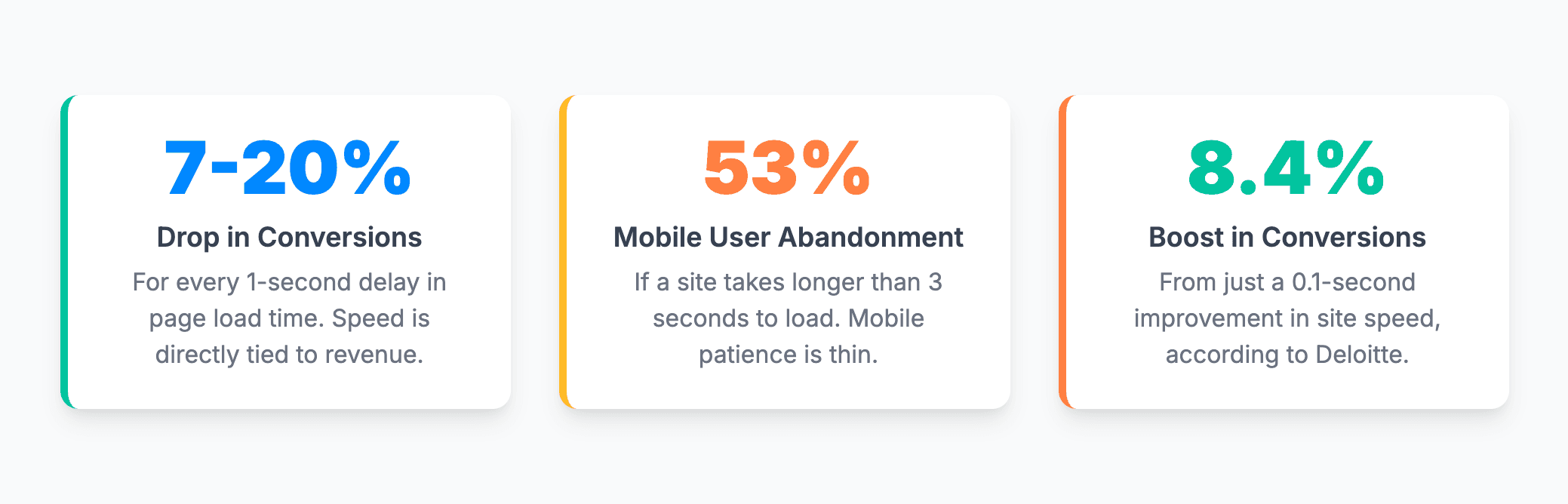
Conversely, the rewards for speed are immense. A landmark study by Deloitte revealed that a mere 0.1-second improvement in site speed can boost retail conversions by 8.4% and increase the average order value by a staggering 9.2%. This proves that performance isn’t about chasing a perfect score; it’s about making incremental, high-impact changes that translate into real business growth. A fast website builds trust, enhances user experience (UX), boosts your SEO rankings, and directly increases your bottom line.
In this comprehensive guide, I’ll walk you through the entire toolkit for website speed optimization, from the foundational pillars to the cutting-edge techniques that are redefining what’s possible.
What You’ll Learn
- Master the foundational pillars of web performance: We’ll dive deep into caching, image optimization, and code cleanup-the non-negotiables for a fast site.
- Learn how to proactively enhance speed: Discover how to use browser resource hints and the revolutionary power of predictive prefetching to create a near-instant browsing experience.
- Understand the crucial difference between lab and field data: I’ll clarify why your Lighthouse score doesn’t always match real-world user experience and which dataset truly matters for your strategy.
- Connect every optimization to Google’s Core Web Vitals: You’ll see exactly how each technique improves your Largest Contentful Paint (LCP), Interaction to Next Paint (INP), and Cumulative Layout Shift (CLS) scores, directly impacting your SEO success.
- Discover the future of performance: See how AI-powered tools like Smart Prefetch are revolutionizing perceived performance and making instantaneous navigation a reality.
The Foundational Pillars: Mastering the Essentials of a Fast Website
Before we get into advanced strategies, we have to nail the basics. These are the three core areas where most performance issues originate. Getting these right will solve the majority of speed problems and set a strong foundation for everything else.
Website Caching Explained: Your Site’s Short-Term Memory
I like to explain caching with a simple analogy: think of it like a barista remembering a regular’s coffee order. The first time you visit, they have to ask for all the details-size, milk, sugar. It takes time. But every subsequent visit, they see you walk in and start making your order instantly. Caching does the same thing for your website’s assets, creating a “short-term memory” that dramatically speeds up the experience for your visitors.
This isn’t a single action but a multi-layered defense against latency. Each layer of caching-from the user’s browser to a global network of servers-works to serve content from the closest, fastest possible location. When a user requests a page, their browser first checks its local cache. If the asset is there, it loads instantly. If not, the request travels to a Content Delivery Network (CDN), which checks its own cache at a server geographically close to the user. Only if both of these miss does the request hit your origin server, where server-side caching can provide one final layer of protection against slow database queries. This cascading system is fundamental to a scalable, high-performance website.

There are three primary types of caching you need to understand:
- Browser Caching: This happens on the user’s device. When someone visits your site, their browser downloads assets like your logo, CSS stylesheets, and JavaScript files. Browser caching stores these files locally on their computer or phone. When they navigate to another page or return to your site later, the browser can load these assets directly from local storage instead of re-downloading them, making repeat visits feel lightning-fast. This is configured on your server using the
Cache-ControlHTTP header, which tells the browser how long to store the files. - Server-Side Caching: This is your first line of defense at the source. For dynamic websites (like those built on WordPress, Magento, or other CMS platforms), pages are often built on-the-fly by querying a database. This is slow and resource-intensive. Server-side caching stores pre-built, static HTML versions of your pages. When a visitor requests a page, the server can send this ready-made version instantly instead of rebuilding it from scratch. This dramatically reduces server processing time and is one of the most effective ways to improve your Time to First Byte (TTFB). Popular techniques include page caching and object caching with tools like Redis or Memcached.
- DNS Caching: This is a more technical but equally important layer. Before a browser can even connect to your server, it has to look up its IP address through the Domain Name System (DNS). DNS caching stores the results of these lookups at various points-on the user’s operating system, with their Internet Service Provider (ISP), and on DNS servers around the world. After the first visit, this lookup becomes nearly instant, shaving off precious milliseconds from the initial connection time.
Image Optimization for Speed: The Heaviest Lift for Performance
If your website is slow, the first place I always look is at the images. In my experience, unoptimized images are the single biggest cause of poor page performance. They are often the largest files on a page, and getting them right can lead to the most dramatic speed improvements.
Here are the four essential best practices for image optimization:
- Compression is Non-Negotiable: Every image you upload should be compressed. Compression reduces file size with minimal impact on visual quality. You need to understand the two types:
- Lossless: Reduces file size with zero loss of quality. Best for graphics with sharp lines and text.
- Lossy: Offers much greater file size reduction by intelligently removing some image data that the human eye is unlikely to notice. This is ideal for photographs.For most websites, a balance is key. Tools like RabbitLoader, TinyPNG, ImageOptim make this process simple and effective.
- Use Modern Image Formats (WebP & AVIF): For years, JPEG and PNG were the standards. Today, modern formats like WebP and AVIF offer vastly superior compression. AVIF images can be up to 50% smaller than JPEGs of comparable quality. Smaller files mean faster downloads and a better LCP score. To use them without breaking your site for older browsers, use the
<picture>HTML element. This allows you to provide modern formats first and a fallback JPEG or PNG for browsers that don’t support them.HTML<picture> <source srcset="image.avif" type="image/avif"> <source srcset="image.webp" type="image/webp"> <img src="image.jpg" alt="A descriptive alt text explaining the image content"> </picture> - Always Specify Image Dimensions: This is one of the most critical and easiest fixes for a common performance problem. Always include
widthandheightattributes on your<img>tags.HTML<img src="image.jpg" width="800" height="600" alt="Descriptive alt text">When you do this, you tell the browser the exact size of the image before it even starts downloading. The browser can then reserve the correct amount of space in the page layout. Without these attributes, the browser doesn’t know how much space to leave. When the image finally loads, it pushes all the other content down, causing a jarring “jump.” This directly harms your Cumulative Layout Shift (CLS) score, a key Core Web Vital that measures visual stability. - Implement Lazy Loading for Off-Screen Images: By default, a browser tries to load every single image on a page as soon as it opens, even the ones at the very bottom that the user may never scroll to. This wastes bandwidth and slows down the initial rendering of the visible content. Lazy loading solves this by deferring the loading of off-screen images until the user scrolls near them. The best part? Modern browsers have this built-in. Simply add the
loading="lazy"attribute to your<img>tags. One crucial warning: Never lazy-load images that are “above the fold” (visible without scrolling), especially your LCP element. Doing so will delay the loading of your most important content and harm your LCP score.
Code Clean-Up: Minification, Compression, and Unused Code Removal
After images, the next heaviest assets on a page are typically CSS and JavaScript files. Bloated, unoptimized code can block the browser from rendering your page and tie up the main processing thread, making the site feel sluggish and unresponsive. You can learn more about how bloated code hurts your bottom line.
- Minification vs. Compression: These two terms are often used interchangeably, but they are distinct processes that work together.
- Minification is the process of removing all unnecessary characters from your source code without changing its functionality. This includes whitespace, comments, and line breaks. It makes the code unreadable to humans but perfectly parsable by browsers.
- Compression happens at the server level. After a file is minified, the server uses an algorithm like Gzip or Brotli to make the file even smaller for its journey across the network to the user’s browser. The browser then decompresses it. When used together, minification and compression can reduce file sizes by up to 90%.
- Removing Unused Code: This is a huge, often-overlooked optimization. Many websites, especially those using large CSS frameworks like Bootstrap or complex JavaScript libraries, load enormous files containing code that is never even used on a particular page. This is incredibly wasteful. You can easily identify this unused code using the Coverage tab in Google Chrome’s DevTools. For CSS, tools like RabbitLoader or PurgeCSS can automatically scan your files and remove any styles that aren’t being used, which is a lifesaver for framework-based sites.
It’s tempting to think that the main cost of code is its download size. While that’s true for initial loading, the hidden cost of excessive JavaScript is far more damaging. The real performance bottleneck is the CPU time required for the browser to parse, compile, and execute that code. All of this work happens on the browser’s “main thread,” the same single thread that’s responsible for handling user interactions like clicks, taps, and typing.
When a user clicks a button, but the main thread is busy executing a large JavaScript file, the browser can’t respond immediately. This delay between the user’s action (the “input”) and the next visual update (the “next paint”) is precisely what the Interaction to Next Paint (INP) metric measures. Therefore, removing unused JavaScript isn’t just about faster downloads and a better LCP; it’s about freeing up the main thread to ensure your site feels instantly responsive to user input, which is critical for a good user experience.
The Proactive Approach: Resource Hints and the Power of Prediction
Once you’ve optimized your existing assets, the next level of performance tuning is to become proactive. Instead of just responding to the browser’s requests, we can start anticipating what it will need next and give it a head start.
Giving the Browser a Head Start with Resource Hints
Resource hints are simple <link> tags you add to the <head> of your HTML that give the browser “insider information” about resources it will need soon. This allows the browser to start fetching or preparing things in the background, saving valuable time.
rel="preconnect": Use this when you know your page will need to fetch resources from a third-party domain, but you don’t know the exact file yet. For example, if you use Google Fonts, you can preconnect to their server. This tells the browser to perform the DNS lookup, TCP handshake, and TLS negotiation ahead of time. When the CSS file eventually requests the font, the connection is already warm and ready to go, saving hundreds of milliseconds. HTML<link rel="preconnect" href="https://fonts.googleapis.com"> <link rel="preconnect" href="https://fonts.gstatic.com" crossorigin>rel="preload": This is a high-priority hint that tells the browser to fetch a resource that is critical for rendering the current page, but which might be discovered late by the browser’s parser. A classic example is a font file that’s only referenced deep inside a CSS file. Without preload, the browser has to download and parse the HTML, then download and parse the CSS, before it even discovers it needs the font. Preloading short-circuits this chain. HTML<link rel="preload" href="/fonts/critical-font.woff2" as="font" type="font/woff2" crossorigin>Note: Usepreloadsparingly. It’s for critical, late-discovered resources only. Preloading non-critical assets can delay more important resources.rel="prefetch": This is a low-priority hint to the browser that a resource will likely be needed for a future navigation. The browser can download this file during idle time after the current page has finished loading. This is the perfect mechanism for fetching assets for the next page in a checkout funnel or the next article in a series. This concept is the foundation for the next evolution in web performance.
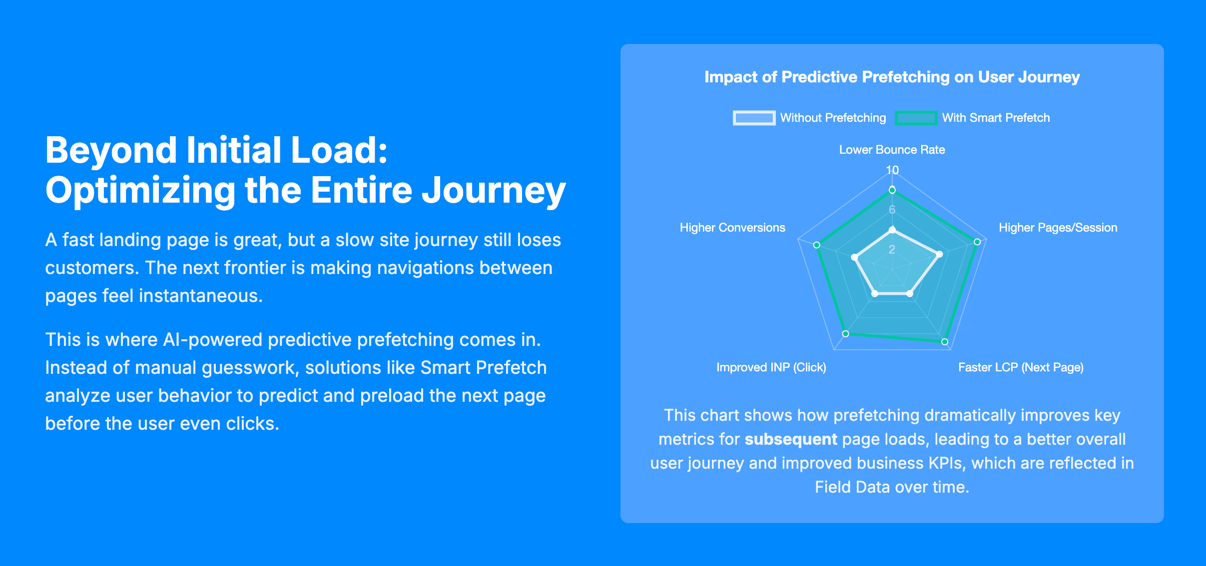
The Next Frontier: AI-Powered Predictive Prefetching
While rel="prefetch" is powerful, manual implementation is often just guesswork. How do you really know which link a user is going to click next? If you prefetch the wrong resources, you’re just wasting the user’s bandwidth and data, which is especially problematic on mobile data plans.
This is where the modern approach comes in: using artificial intelligence to analyze real user navigation patterns and accurately predict the most likely next page a user will visit. This intelligence is used to power the modern Speculation Rules API, a new browser standard that gives developers fine-grained control over prefetching.
And this is where tools like Smart Prefetch are changing the game. Instead of manual guesswork, Smart Prefetch is a plugin that uses AI-based predictions to prefetch the next most likely page before users click. The result is a browsing experience where subsequent page loads feel completely instantaneous, delighting users and dramatically improving engagement.
The Measurement Nuance: Why Lab Scores Don’t Tell the Whole Story
A common question I get is: “I installed a prefetching solution, but my PageSpeed Insights score didn’t change. Why?” This is a critical misunderstanding of what different performance tools measure, and it’s essential to grasp this distinction.
- Lab Data (Lighthouse, Google PageSpeed Insights): These tools run a synthetic test. They load a single page in a controlled, simulated environment, usually from a “cold” cache with no prior history. They are designed to analyze and debug the initial loading performance of that one page. Because they have no concept of a user’s journey or a “next” page, they are physically incapable of measuring the benefit of a prefetched navigation.
- Field Data (Chrome User Experience Report – CrUX, Google Search Console): This is the gold standard. This data is collected from actual Chrome users who have opted-in, aggregated over a 28-day period. This data reflects entire user journeys across a vast range of devices and network conditions. This is the data Google uses for its page experience ranking signals. While CrUX doesn’t have a specific metric called “prefetched load time,” the profound positive effects of a near-instant experience-lower bounce rates, longer session durations, and higher conversion rates-are absolutely reflected in this real-world data over time.
This distinction highlights a fundamental shift in web performance strategy. For years, our focus was almost exclusively on optimizing the initial load of a single page-a page-level metric that lab tools excel at measuring. But user satisfaction and business goals are tied to the entire session. A user who lands on a fast page but gets frustrated by slow navigation between subsequent pages is still a lost customer.
Predictive prefetching tools like Smart Prefetch directly target this “in-between page” latency, which is a major friction point in the user journey. By doing so, we move from page-level optimization to journey-level optimization. We are optimizing for an experience that lab tools can’t see but that directly correlates with user happiness and business outcomes. A mature performance strategy, therefore, must use lab tools for debugging the initial load and journey-optimization tools like Smart Prefetch for the subsequent experience, with field data serving as the ultimate source of truth.
Connecting the Dots: How Optimization Impacts Core Web Vitals
So, why does all this matter for your SEO? Because Google has given us a clear set of metrics that quantify user experience: the Core Web Vitals. These are a confirmed ranking factor, meaning better scores can lead to better visibility in search results. Every technique we’ve discussed directly improves one or more of these vitals.
Let’s quickly define them:
- Largest Contentful Paint (LCP): Measures loading performance. It’s the time it takes for the largest image or text block to become visible in the viewport. A good score is under 2.5 seconds.
- Interaction to Next Paint (INP): Measures responsiveness and interactivity. It’s the time from a user’s interaction (like a click) until the next visual update is painted on the screen. A good score is under 200 milliseconds.
- Cumulative Layout Shift (CLS): Measures visual stability. It quantifies how much unexpected content movement occurs during page load. A good score is less than 0.1.
Here is a clear breakdown of how the optimization techniques we’ve covered map directly to these crucial metrics:
| Optimization Technique | Primary CWV Impact | How It Helps |
|---|---|---|
| Server-Side Caching / CDN | LCP | Reduces Time to First Byte (TTFB), which is the first phase of the LCP timeline. A faster server response means the browser can start rendering sooner. |
| Image Compression & Modern Formats | LCP | Directly reduces the file size of what is often the LCP element, making it download and render much faster. |
| Specifying Image Dimensions | CLS | Prevents layout shifts by telling the browser to reserve the correct amount of space for the image before it has finished downloading. |
| Removing Unused/Render-Blocking JS | LCP & INP | Improves LCP by allowing the browser to render content sooner. Improves INP by freeing up the main thread so it can respond to user interactions immediately. |
| Predictive Prefetching (e.g., Smart Prefetch) | User Experience (Field Metrics) | Creates near-instant subsequent page loads. While this doesn’t affect the initial LCP of a landing page, it drastically improves the user’s journey, which is reflected in field data (CrUX) through better engagement signals over time. |
Important FAQ
I get asked a lot of the same questions when consulting with clients. Here are the answers to the most common ones.
Why is my PageSpeed Insights score different from what my real users experience?
This goes back to the lab vs. field data distinction. PageSpeed Insights provides lab data from a one-time test run on a Google server with a specific network and device configuration. It’s a clean, controlled environment perfect for debugging. Your field data, seen in the Google Search Console Core Web Vitals report, comes from the Chrome User Experience Report (CrUX). It’s an aggregation of real user sessions over the last 28 days, across all their different devices, locations, and network speeds. Field data is messier but reflects reality. It’s also what Google uses as a ranking signal, making it your ultimate source of truth.
Is website optimization a one-time fix?
Absolutely not. I’ve seen too many teams achieve a great Lighthouse score, celebrate, and then watch it degrade over the next six months. Performance is an ongoing process, not a one-and-done project. New features are added, marketing teams upload unoptimized images, and third-party scripts change. You need to establish a culture of performance, with regular monitoring and a “performance budget” to prevent regressions.
Will prefetching use up too much of my visitors’ data?
This is a valid concern, especially with crude, manual prefetching. Downloading assets a user never needs is wasteful. However, intelligent, modern solutions are built to mitigate this risk. An AI-powered tool like Smart Prefetch uses sophisticated predictive models to ensure a high hit rate, drastically reducing the number of wasted prefetches. Furthermore, these tools are designed to be good citizens of the web; they typically only prefetch when the browser is idle and the network is not congested, and they respect user settings like the “Save-Data” header to avoid running up data charges for users on limited plans.
Conclusion: Building a Culture of Performance
Achieving a truly fast website isn’t about a single magic bullet. It requires a holistic strategy that combines a rock-solid foundation with forward-thinking technology. It starts with mastering the essentials: implementing a multi-layered caching strategy, rigorously optimizing every image, and keeping your code lean and efficient. These are the fundamentals that improve your baseline performance and your Core Web Vitals.
But in 2025 and beyond, simply having a fast initial page load is no longer enough. The frontier of web performance has shifted from optimizing a single moment in time to optimizing the entire user journey. The future is about creating a seamless, fluid, and instantaneous-feeling experience from one page to the next. Predictive prefetching is the key that unlocks this future. By intelligently anticipating user needs, you can eliminate the frustrating wait times that kill engagement and conversions.
You’ve learned the techniques to build a fast foundation. Now, it’s time to make your site feel instantaneous. Try Smart Prefetch and see how AI-powered predictive prefetching can transform your user experience and boost your bottom line.

Sandeep Kumar
With over 14 years of hardcore backend engineering experience, Sandeep is a verified technical expert on server-side performance. He specializes in deep infrastructure optimization, building highly scalable backends, and ensuring lightning-fast load times for high-traffic stores and web applications.